Jared Ireland | Designs
Featured Work
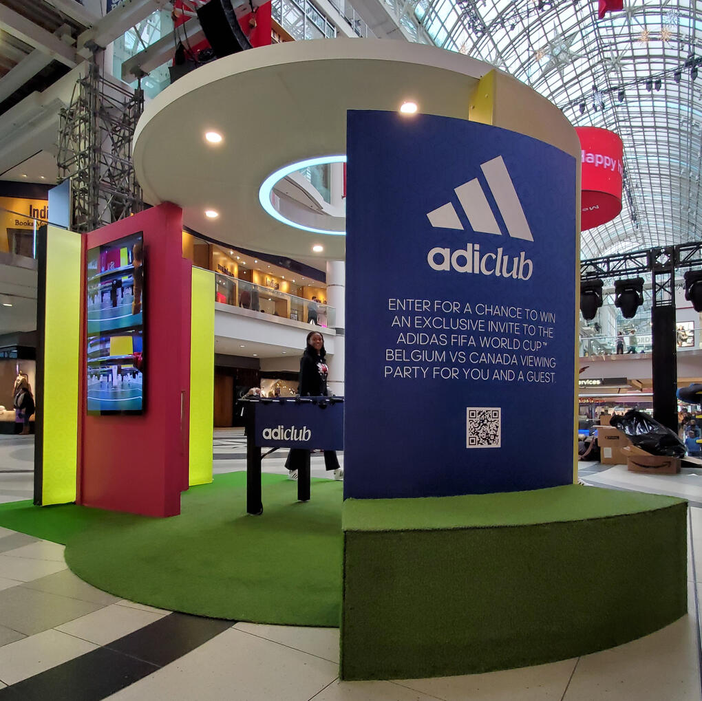
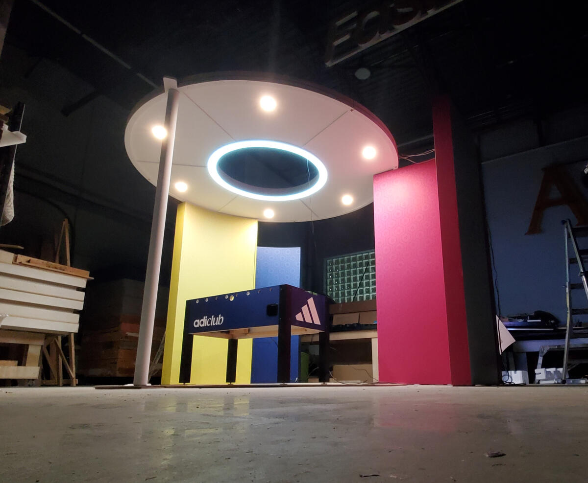
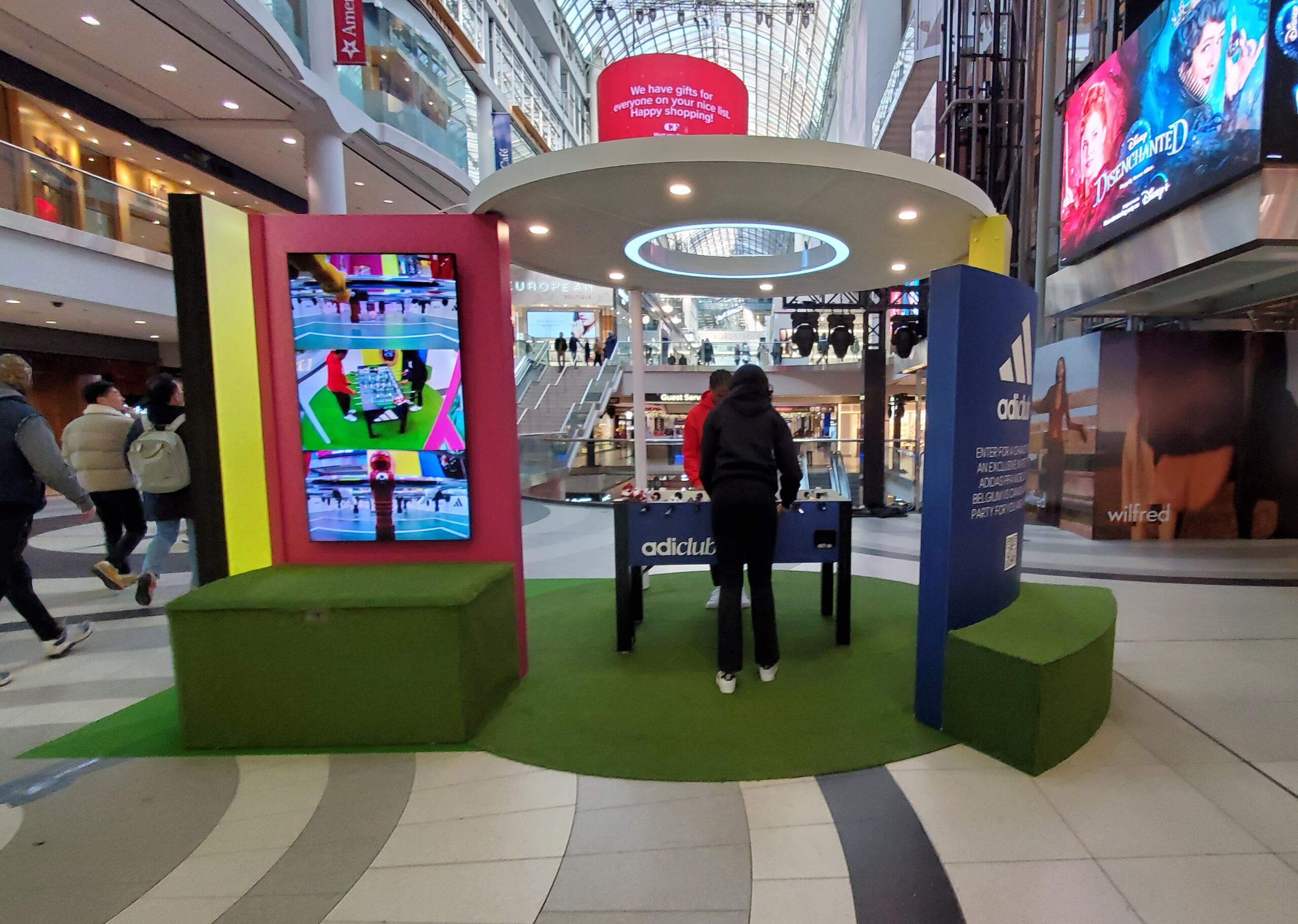
Adidas | World Cup 2022
Interactive pavilion activation for FIFA x Adidas, engaging the public through an innovative foosball experience.
Reznick | carpet showroom
Inventive retail displays for the R:DESIGN showroom, featuring MC Escher inspired stair-runner installation.
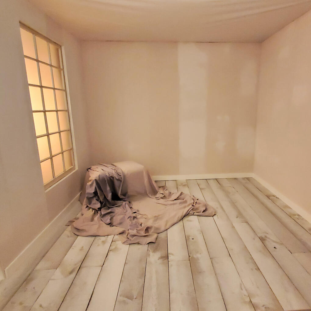
Getty Images | TIFF 2024
Elegant and rustic photography studio set for Getty Images at TIFF 2024, at the Intercontinental Hotel Toronto.
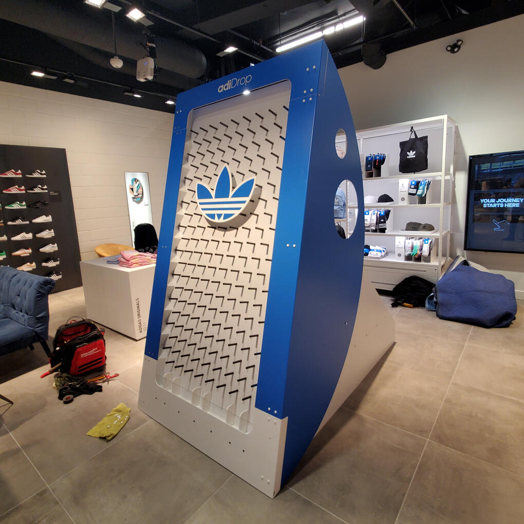
Adidas | adi-drop
Interactive plinko board installation for Adidas to celebrate OG brand launch in Vancouver + Toronto
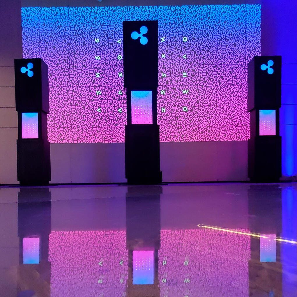
RIPPLE | Cryptic Kiosks
Atmospheric cryptogram reveal for RIPPLE's talent search challenge for their first Toronto office.
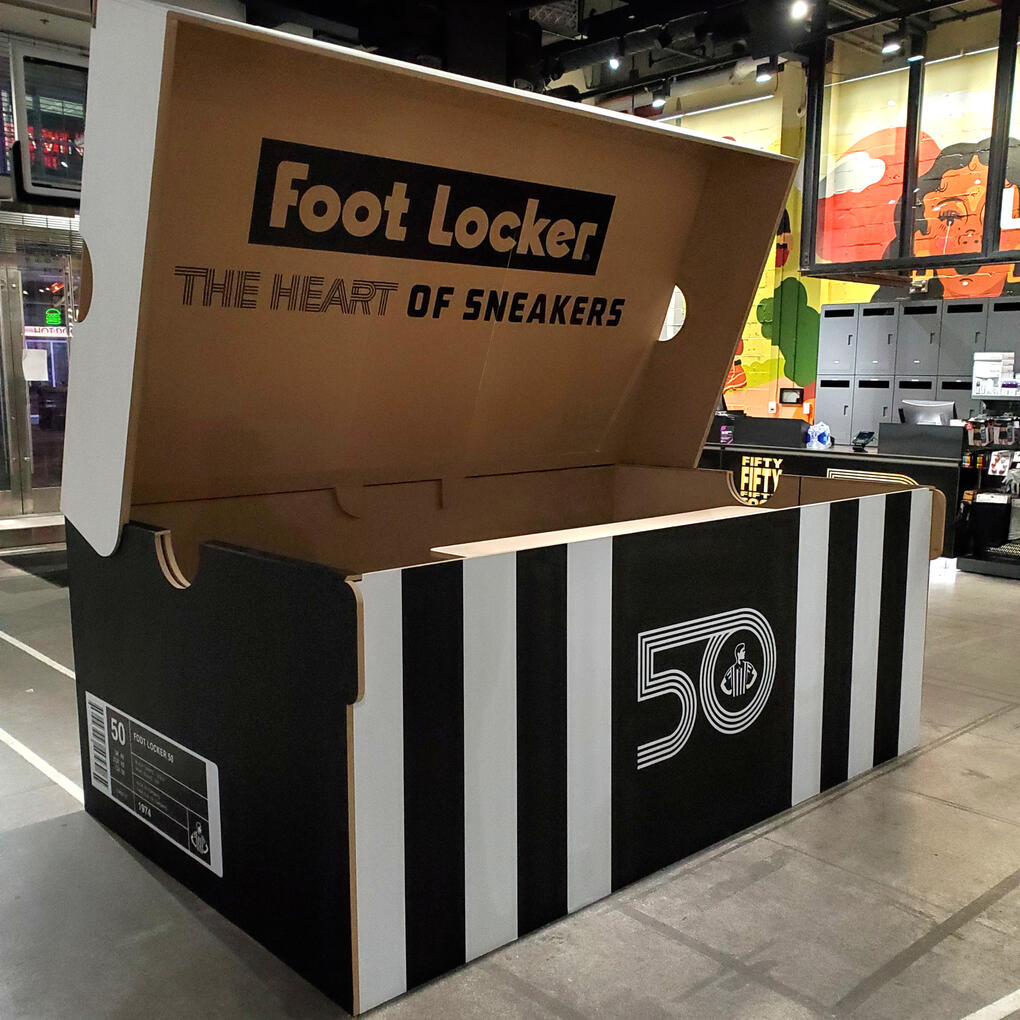
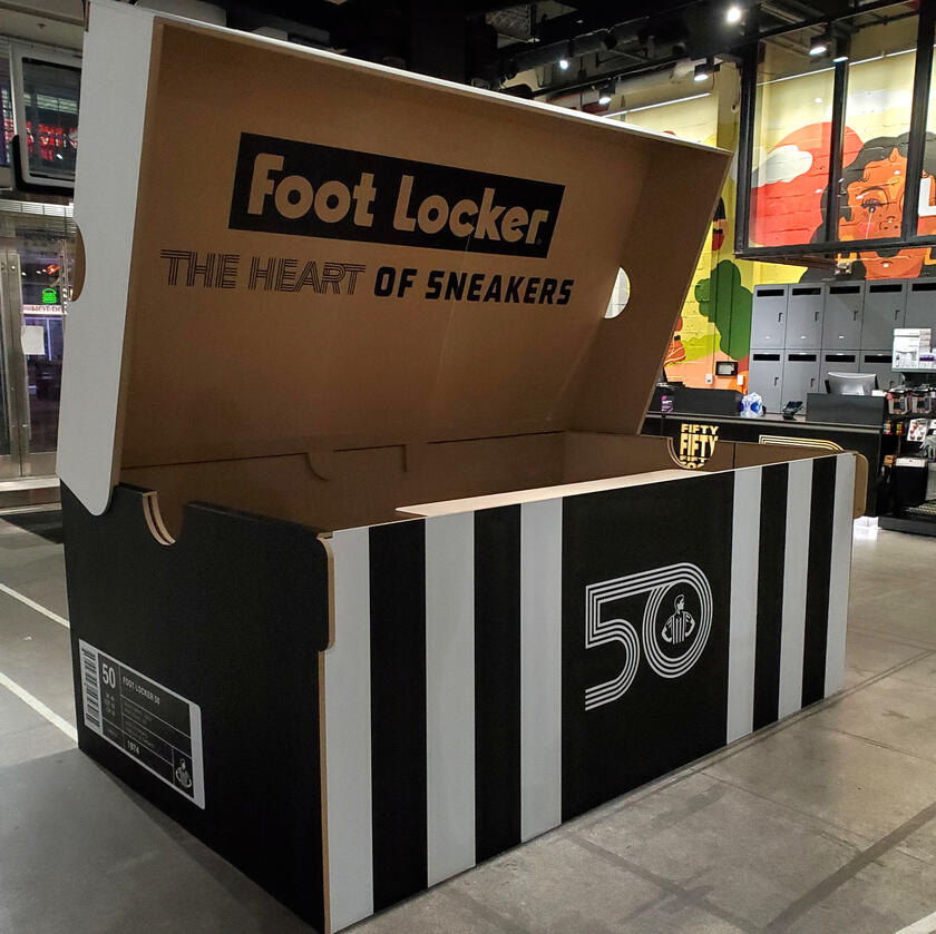
FOOTLOCKER | DJ Shoe Box
Playful DJ booth designed to look like a 10ft scale shoebox for Footlocker's 50th anniversary exclusives celebration.
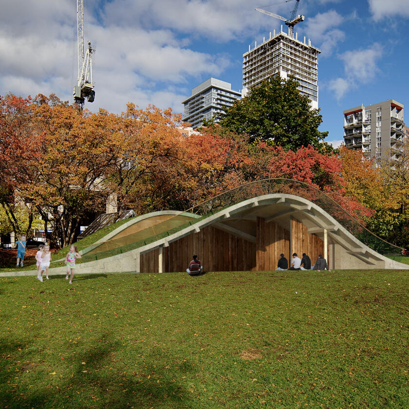
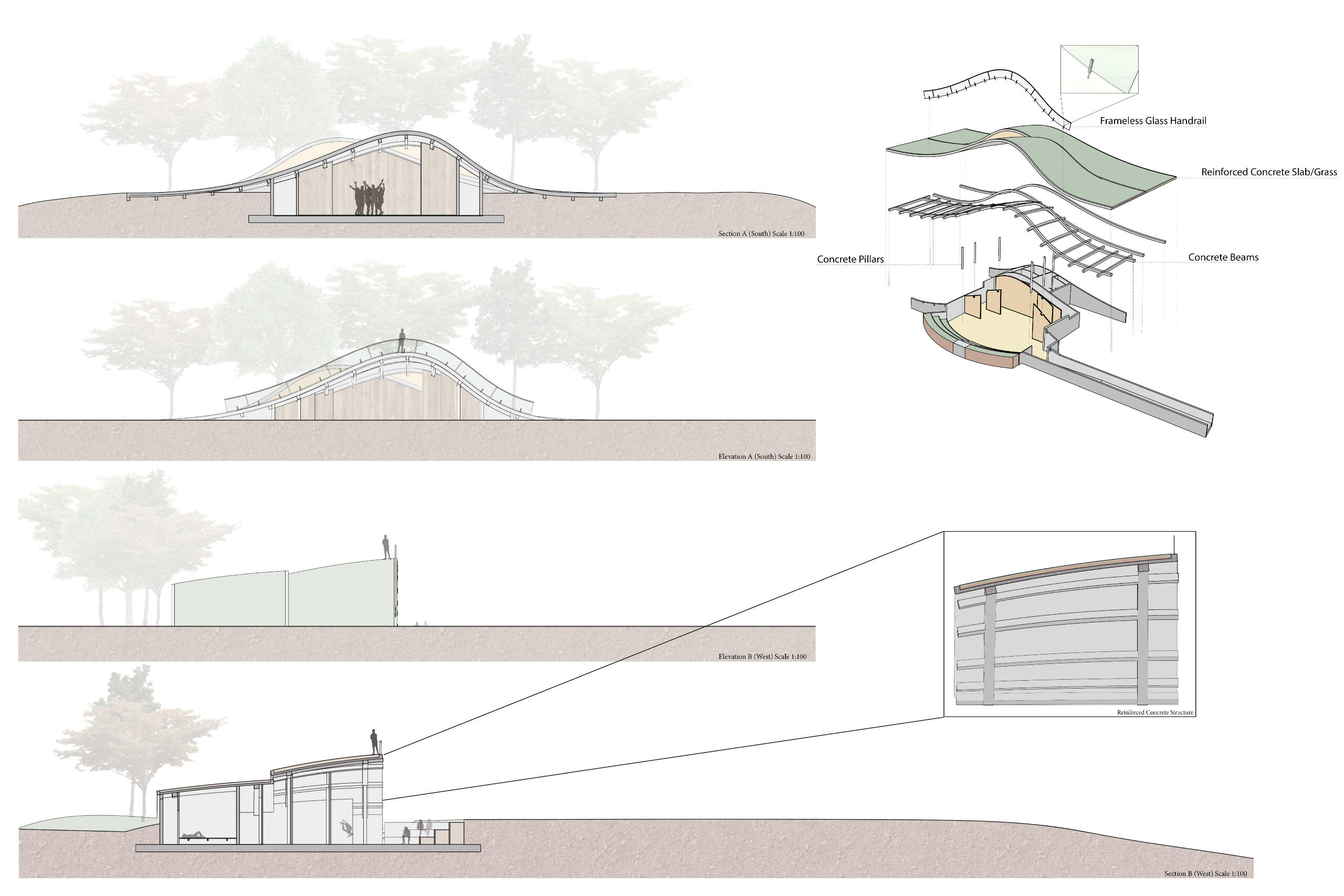
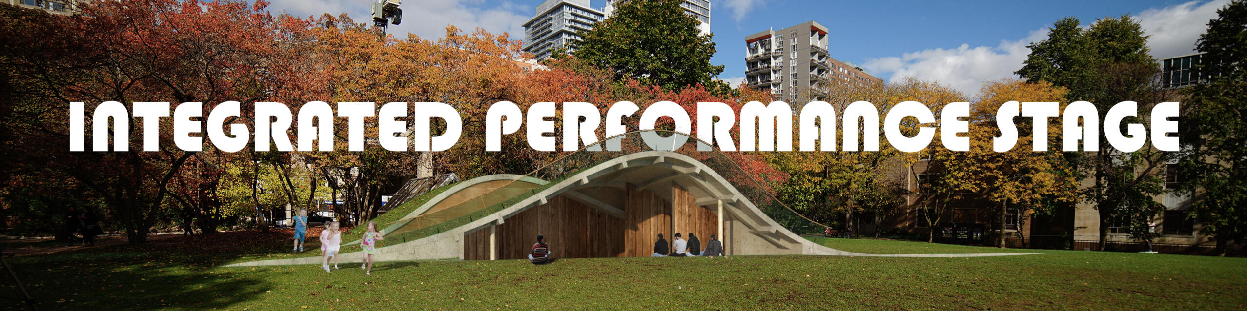
INTEGRATED | Performance Stage
Design for performance stage emerging from the earth within the Kerr Hall Quad.

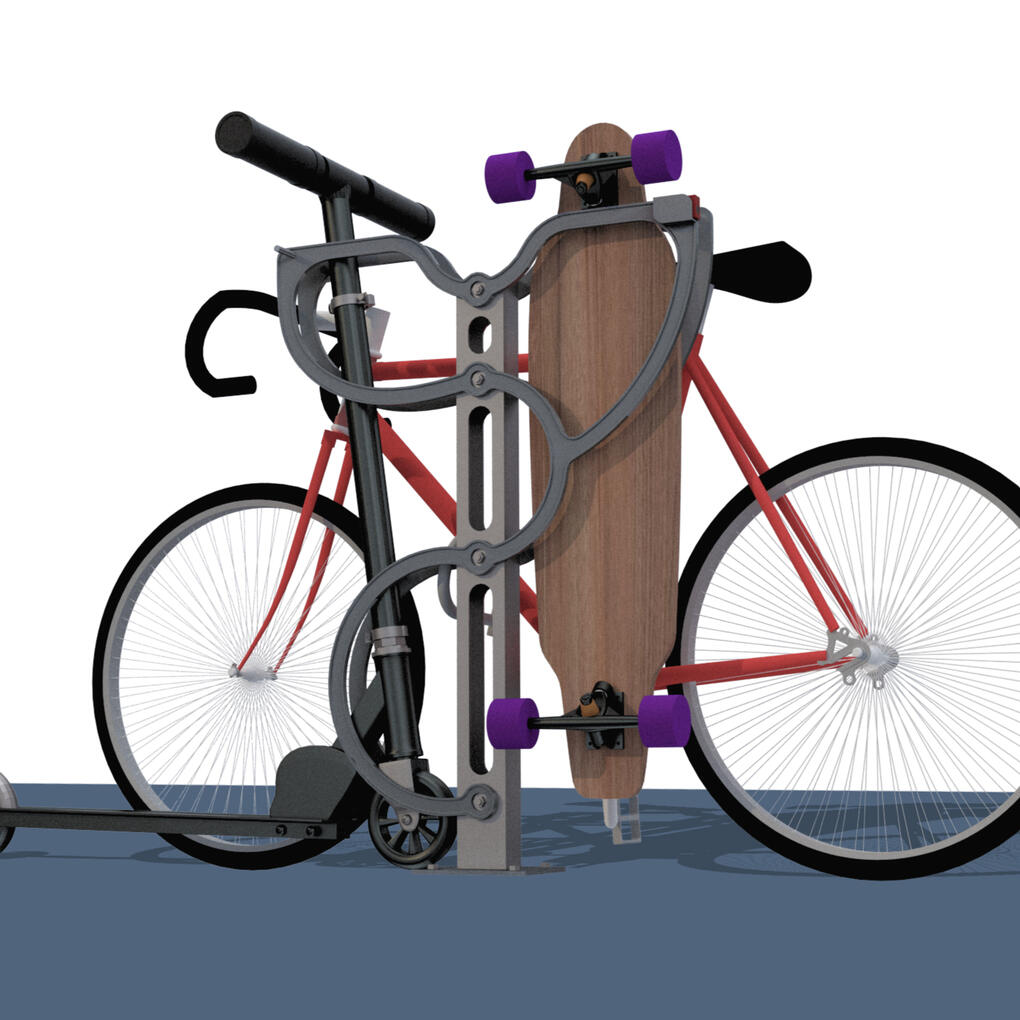
STINGRACK | bike, board & Scooter
Competition winning multi-modal rack that accommodates bikes, boards and scooters in Toronto.
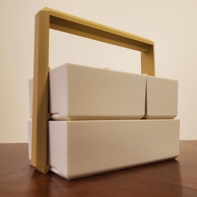
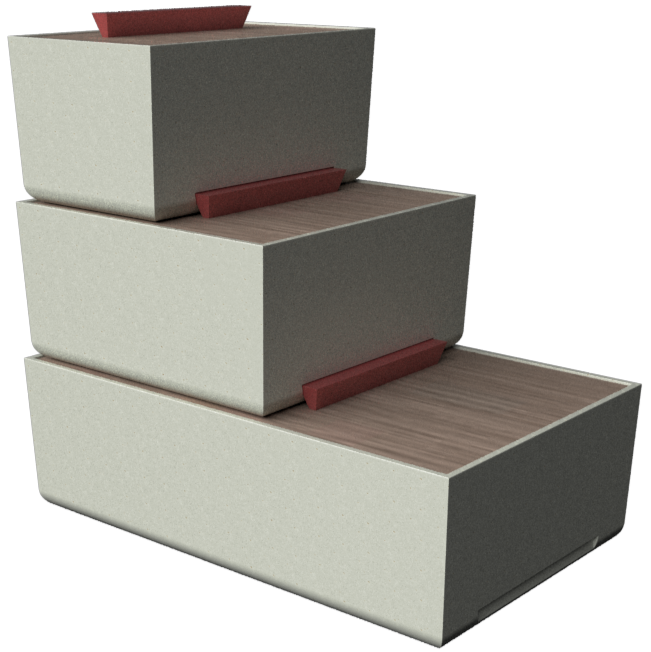
Stackt | Container
Muji inspired, three-piece ceramic lunchbox, featuring an easy-snap wooden handle for meals on the go.

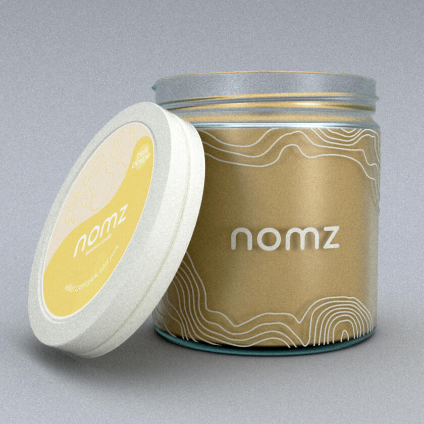
nomz | Beeswax Candle Design
Winning design of the Ted Rogers Retail Conference case competition, OMNI 2021.
HIGH ROLLER | Electronic dice
An over-designed, modular dice-disk roller.

G'RILLA | Logo Design
Four logo brand package commissioned by a local indie theatre & production company called G'RILLA.
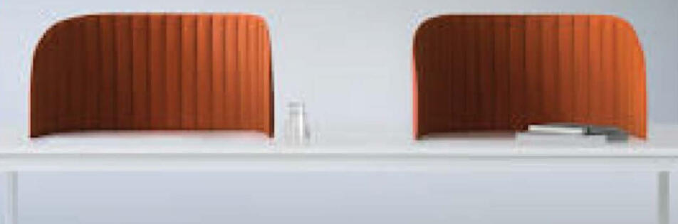
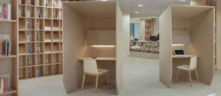
Shhhield | Acoustic Screen
Portable acoustic barrier for those who record audio outside of a dedicated studio environment.
Adidas | World Cup '22 Pavilion
Interactive pavilion activation for FIFA x Adidas, engaging the public through an innovative foosball experience.

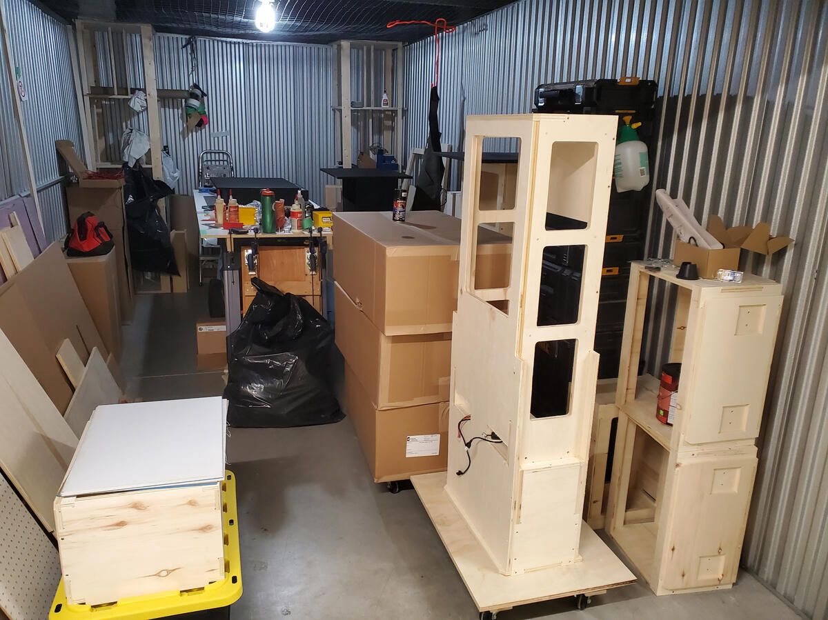
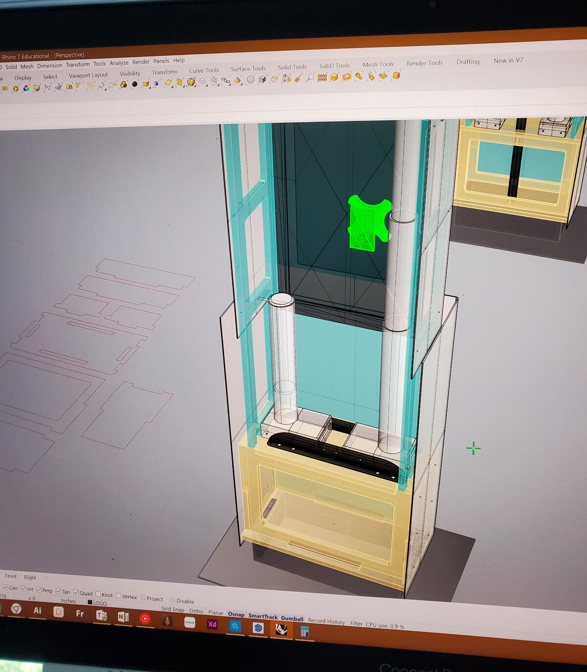
Design / Build Process


Designed by Jano Badovinac // Fugitive Glue
TITLE - Junior Designer
ROLES - Design Fabricator, Design Engineer, Installation Lead
TIMELINE - October to November 2022
LOCATION - Eaton Centre & Sherway Gardens
CLIENT - Adidas & FIFA
STAKEHOLDERS - FIFA World Cup, Cadillac Fairview, TENK
BUILD PARTNERS - UB Signs, Mcrae Imaging, Fugitive Glue
Production journey
Video for IG Reels
THE EXPERIENCE


SKILL DEVELOPMENT
SOFTWARE - Rhino, Illustrator, OBS
HARD SKILLS - Carpentry, 3D Modeling, CNC Design, fabrication, lighting & tech setup
SOFT SKILLS - Leadership, experiential design, on-site adaptability

Reznick | Carpet Showroom
Inventive retail displays for the R:DESIGN showroom, featuring MC Escher inspired stair-runner installation.
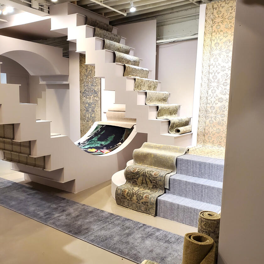
ESCHER ROOM + Showroom


Designed by Jano Badovinac + Jared Ireland
TITLE - Industrial Designer
ROLES - Team Leader, Design Engineer, Design Fabricator, Interior Designer
TIMELINE - August 2022 to March 2023
LOCATION - 118 Schell Ave, Toronto, ON M6E 0A4, Canada
CLIENT - Reznick Event Carpets
STAKEHOLDERS - Reznick, R:DESIGN, Fugitive Glue
SHOUTOUTS - Carpentry: Ryan Carney
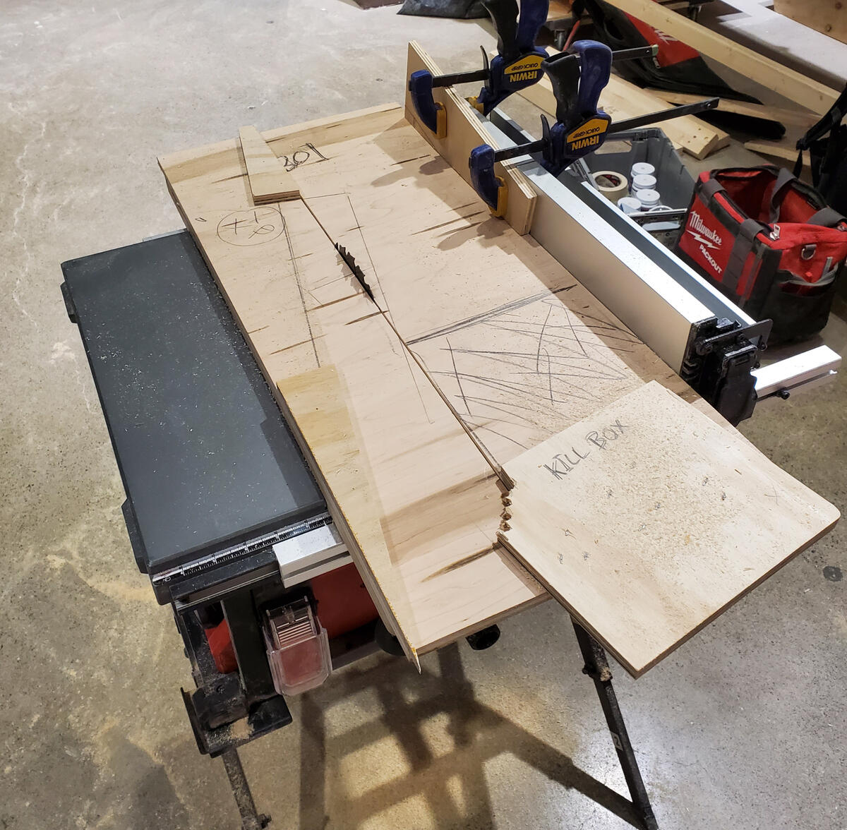
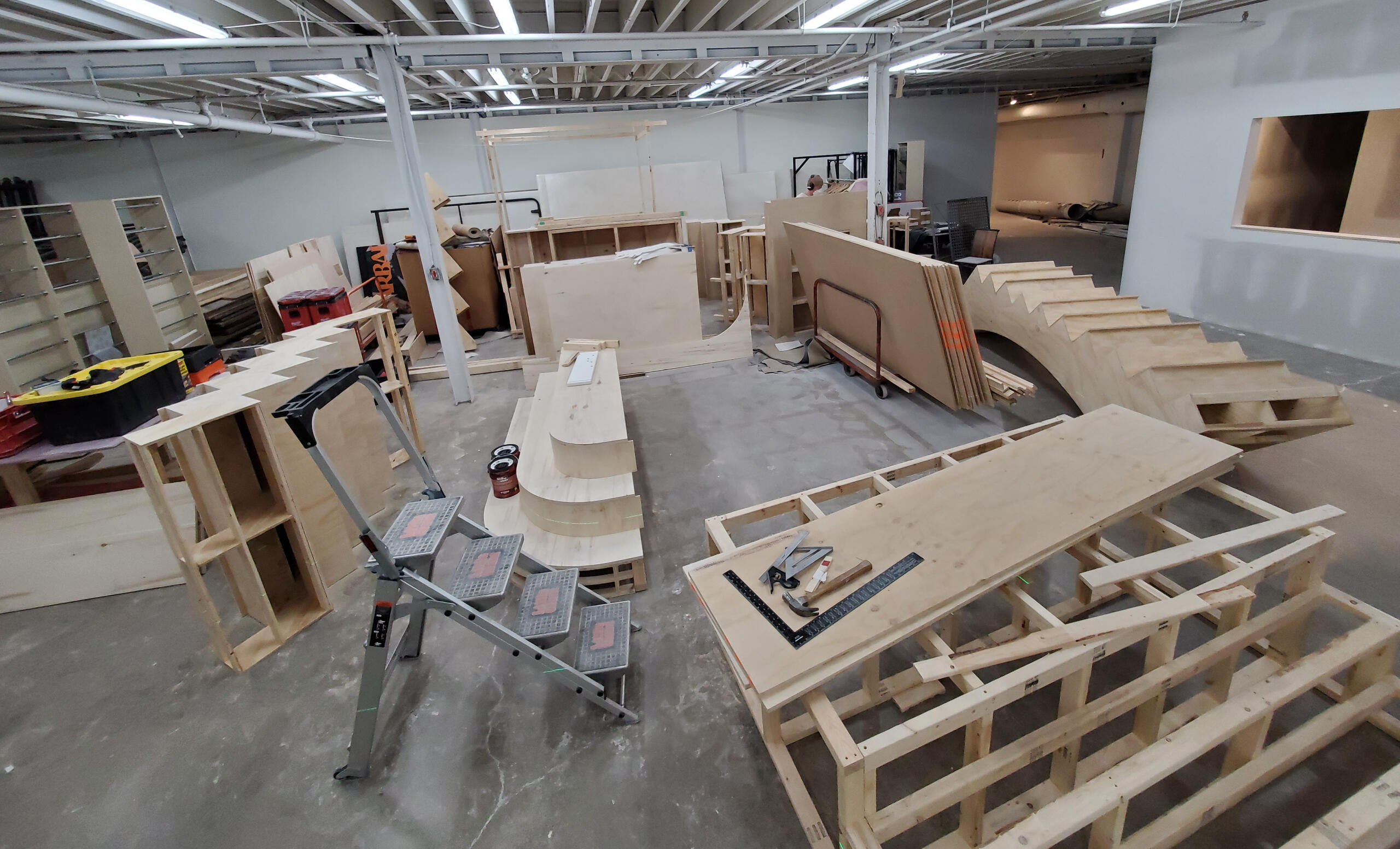
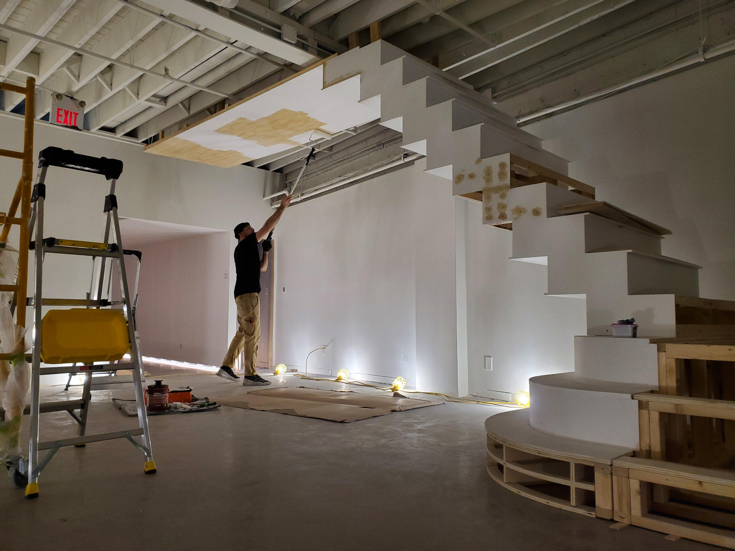
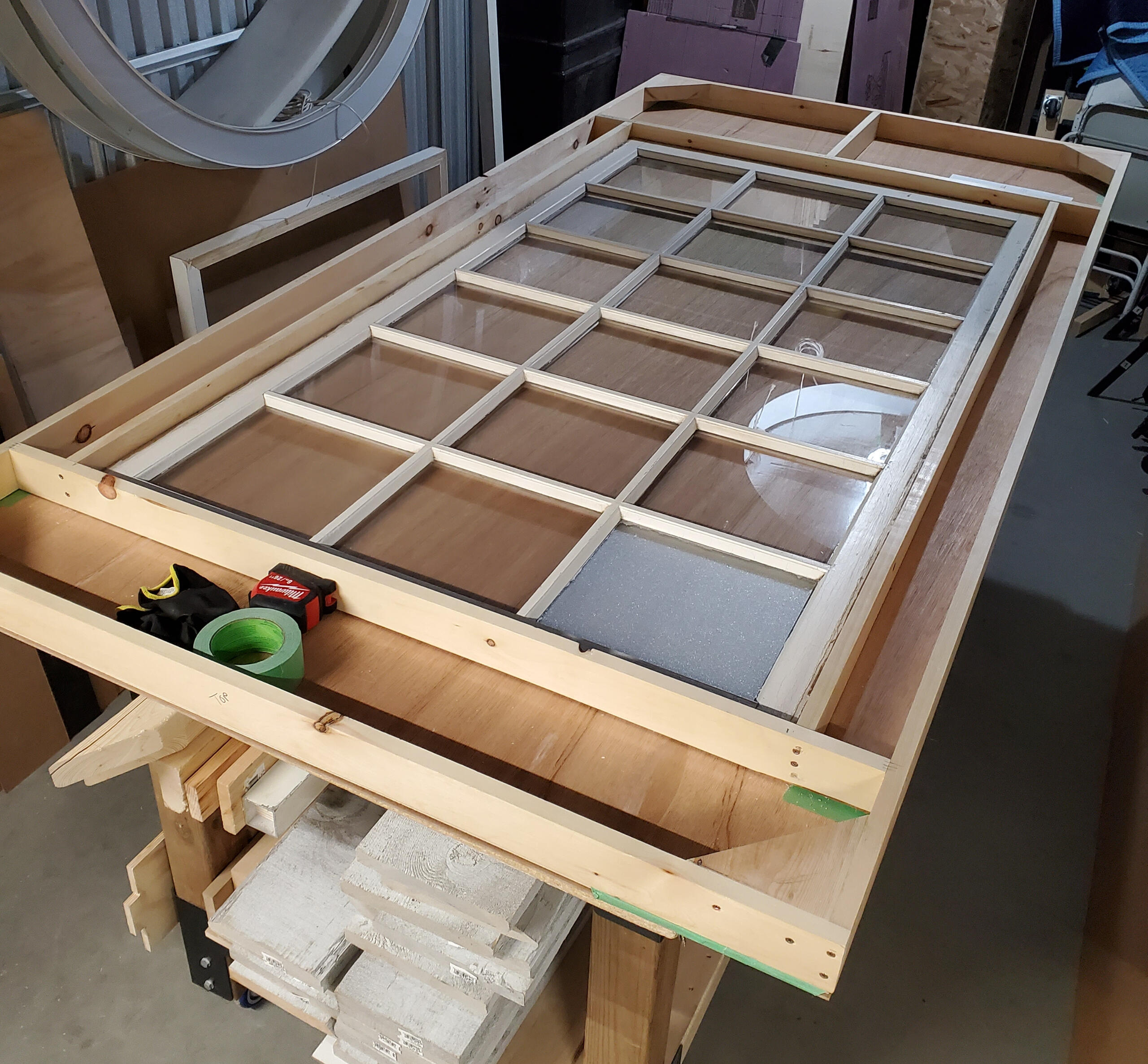
ESCHER ROOM BUILD PROCESS


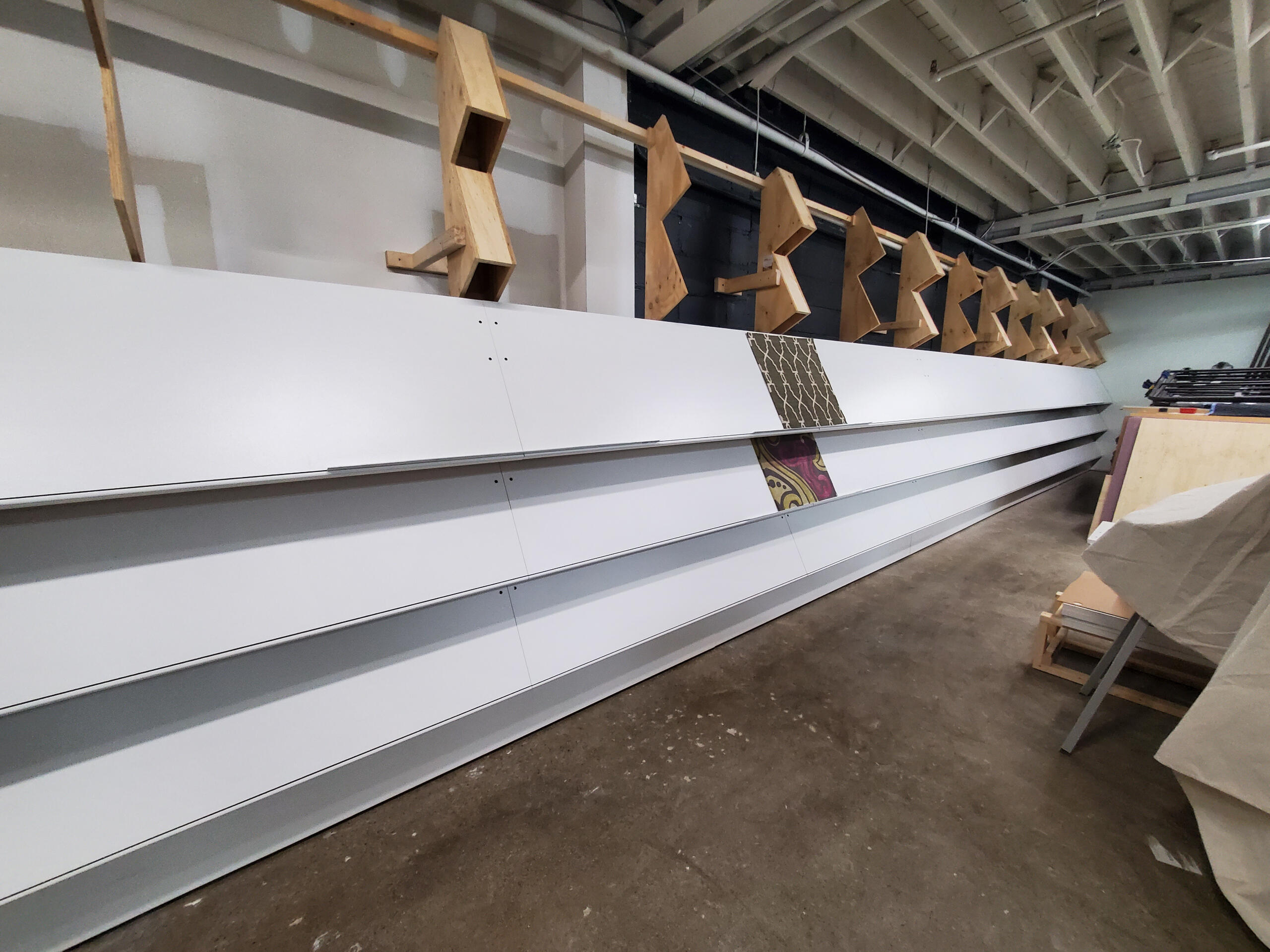
ESCHER ROOM Install + Finishing


SKILL DEVELOPMENT
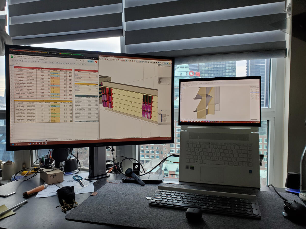
SOFTWARE - Rhino, Illustrator, Excel
HARD SKILLS - Carpentry, CNC design, production drawings, materials sourcing, budgeting, site analysis
SOFT SKILLS - Leadership, Project management, problem solving, divergent thinking
Showroom Sample Wall + Sample Cove


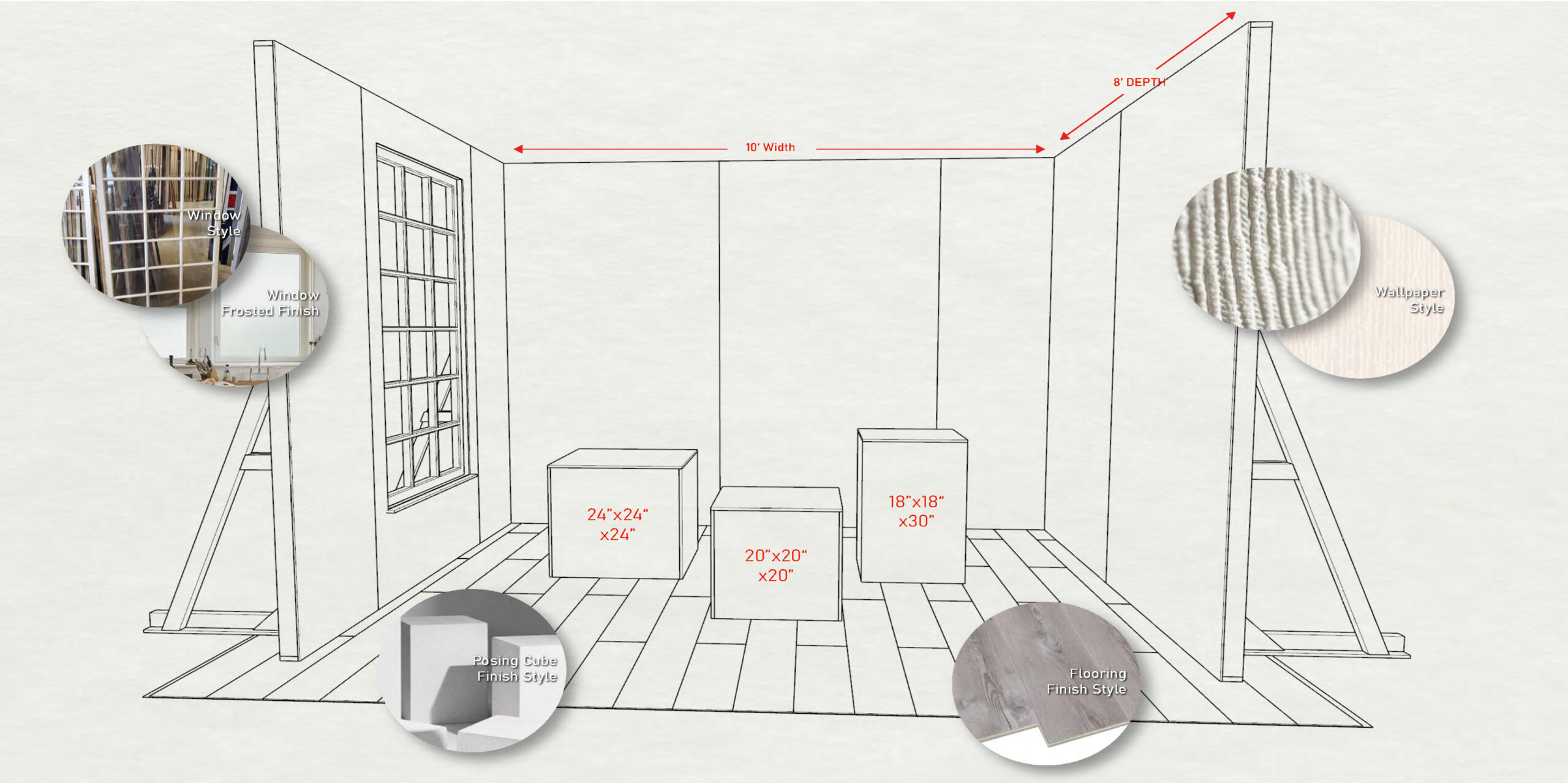
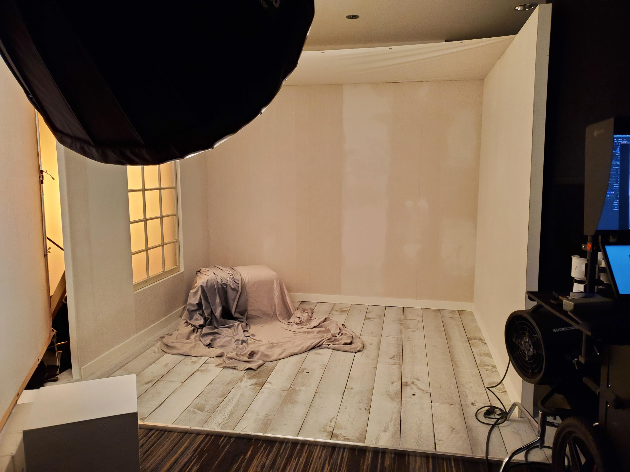
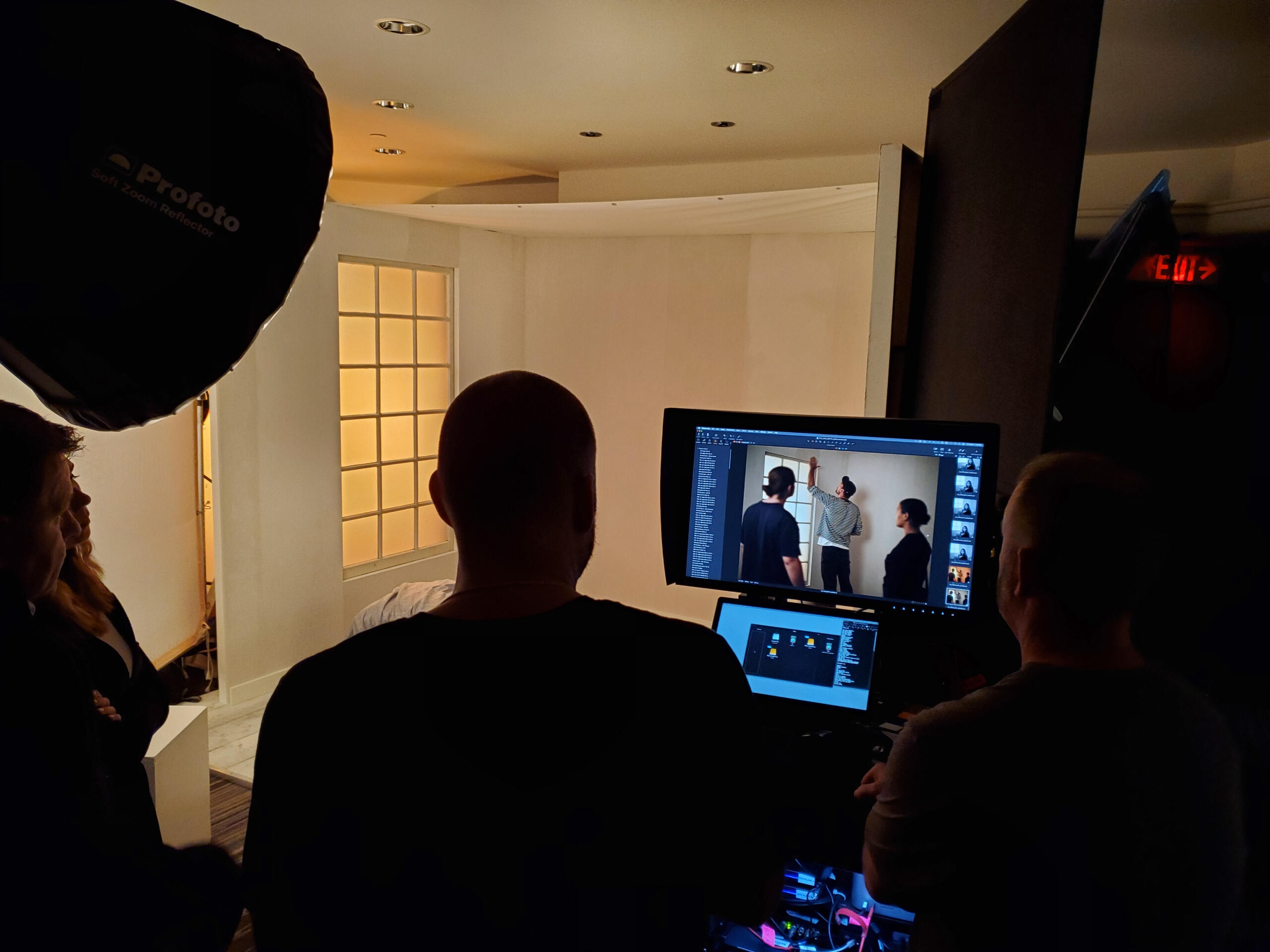
Getty Images | TIFF 2024
Elegant and rustic photography studio set for Getty Images at TIFF 2024, at the Intercontinental Hotel Toronto.
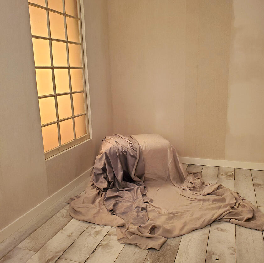
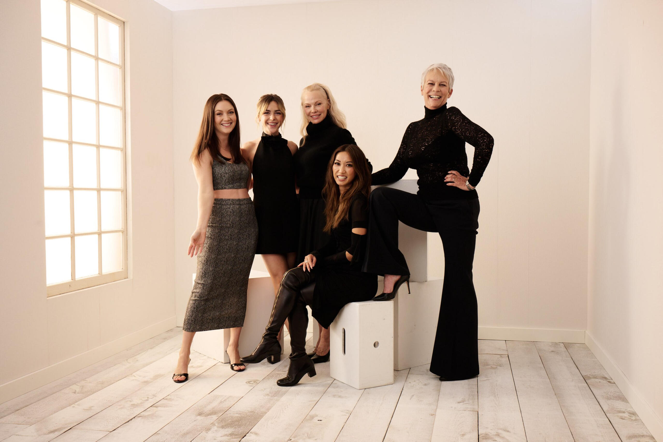
Credit: Gareth Cattermole // Collection: Getty Images Entertainment
Concept Pitch


Designed by Jared Ireland // Fugitive Glue
TITLE - Lead Designer
ROLES - Project Lead, Design Fabricator, Install Lead
TIMELINE - August 2024 to September 2024
LOCATION - Intercontinental Hotel Toronto
CLIENT - Getty Images
STAKEHOLDERS - TIFF, Intercontinental Hotel Toronto
BUILD PARTNERS - Fugitive Glue
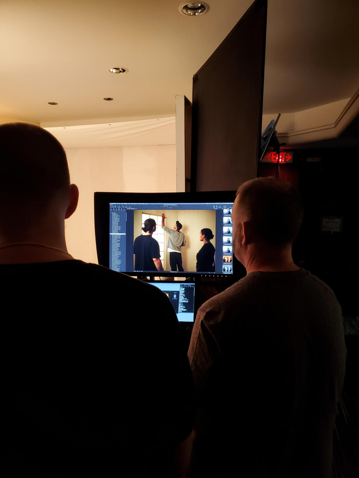
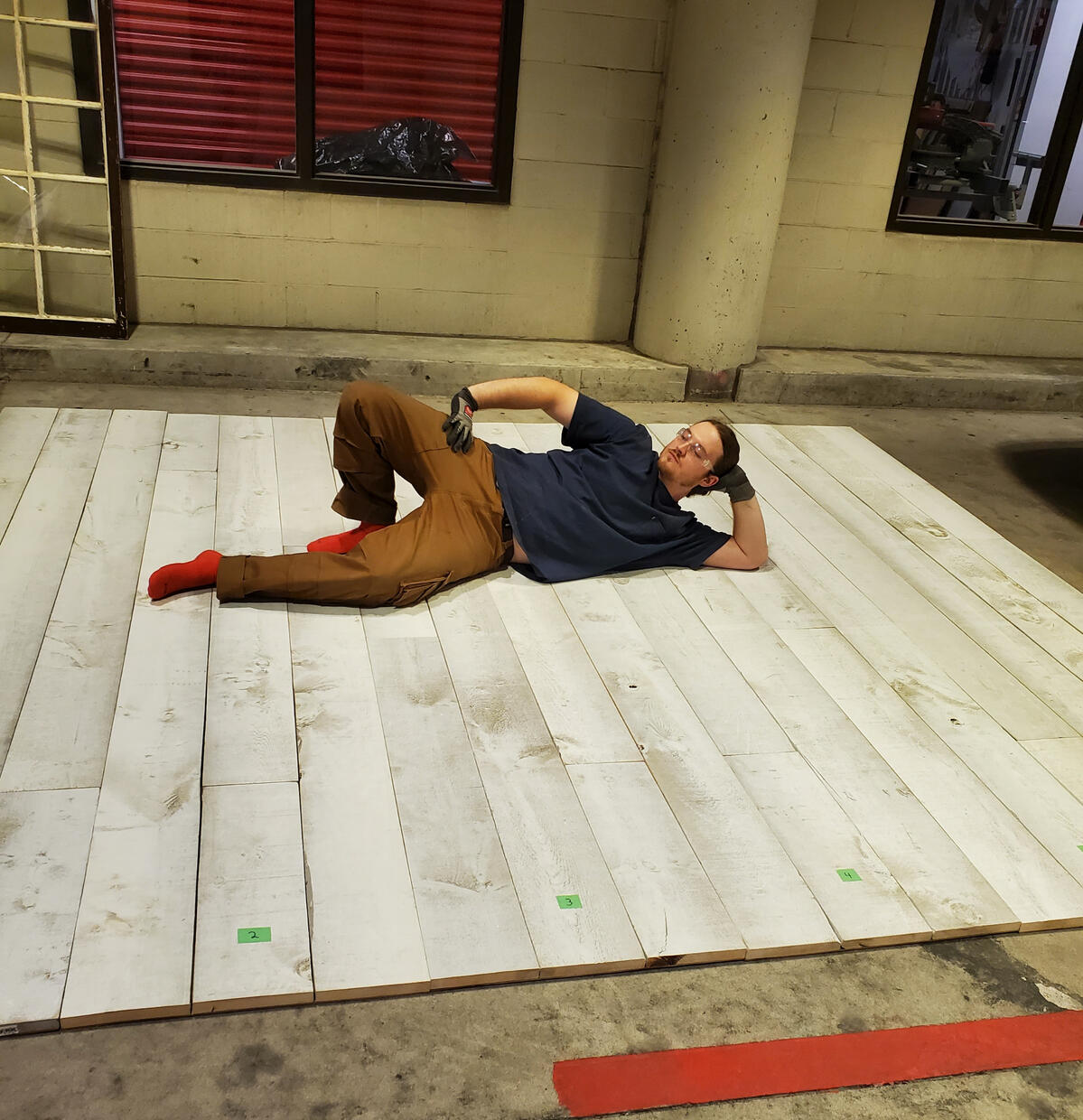
Production


Photos From Shoot
Credit: Gareth Cattermole // Collection: Getty Images Entertainment
Installation


SKILL DEVELOPMENT
SOFTWARE - Rhino, Illustrator, Excel
HARD SKILLS - Carpentry, 3D Modeling, Set Design, fabrication, budgeting, material sourcing
SOFT SKILLS - Leadership, on-site adaptability, client relations, timeline management
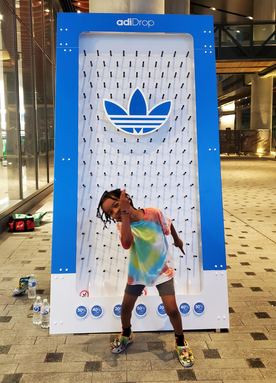
ADIDAS | Adi-Drop
Interactive plinko board installation for Adidas to celebrate OG brand launch in Vancouver + Toronto
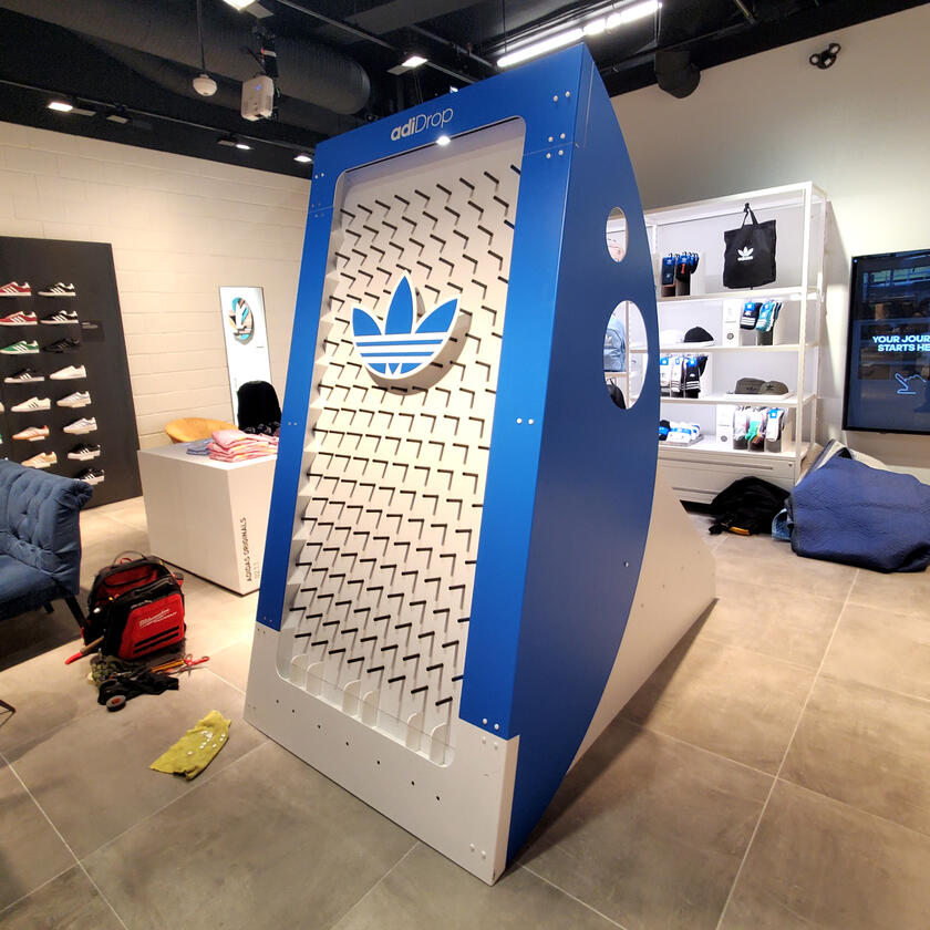
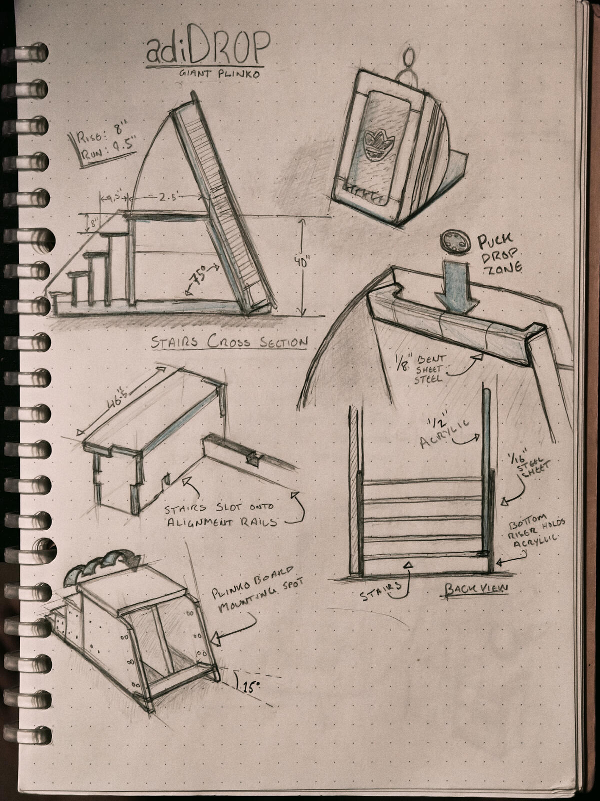


Plinko Simulation
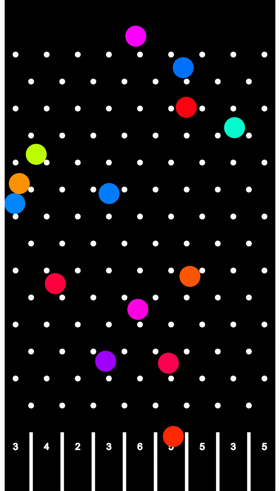
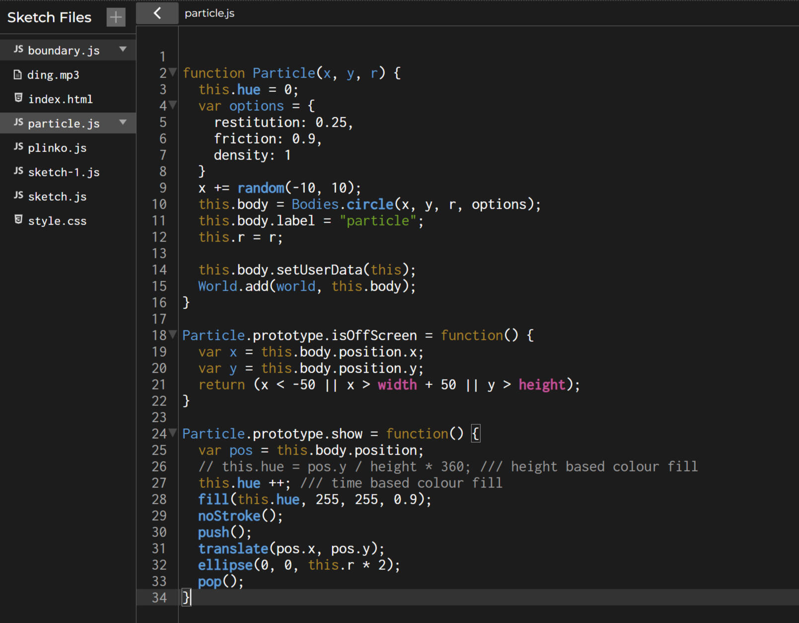
Code used to generate simulation of the Plinko board based on the position of the pegs and number of rows. This animation helped generate a probability of a puck dropping in each bin so that the client could understand how to distribute the prizes - based on number of projected guests vs number of prizes to give away.This code was also useful to figure out the optimal spacing of the pegs & puck size, to achieve the best fall-rate and mitigate the likelihood of pucks getting stuck.
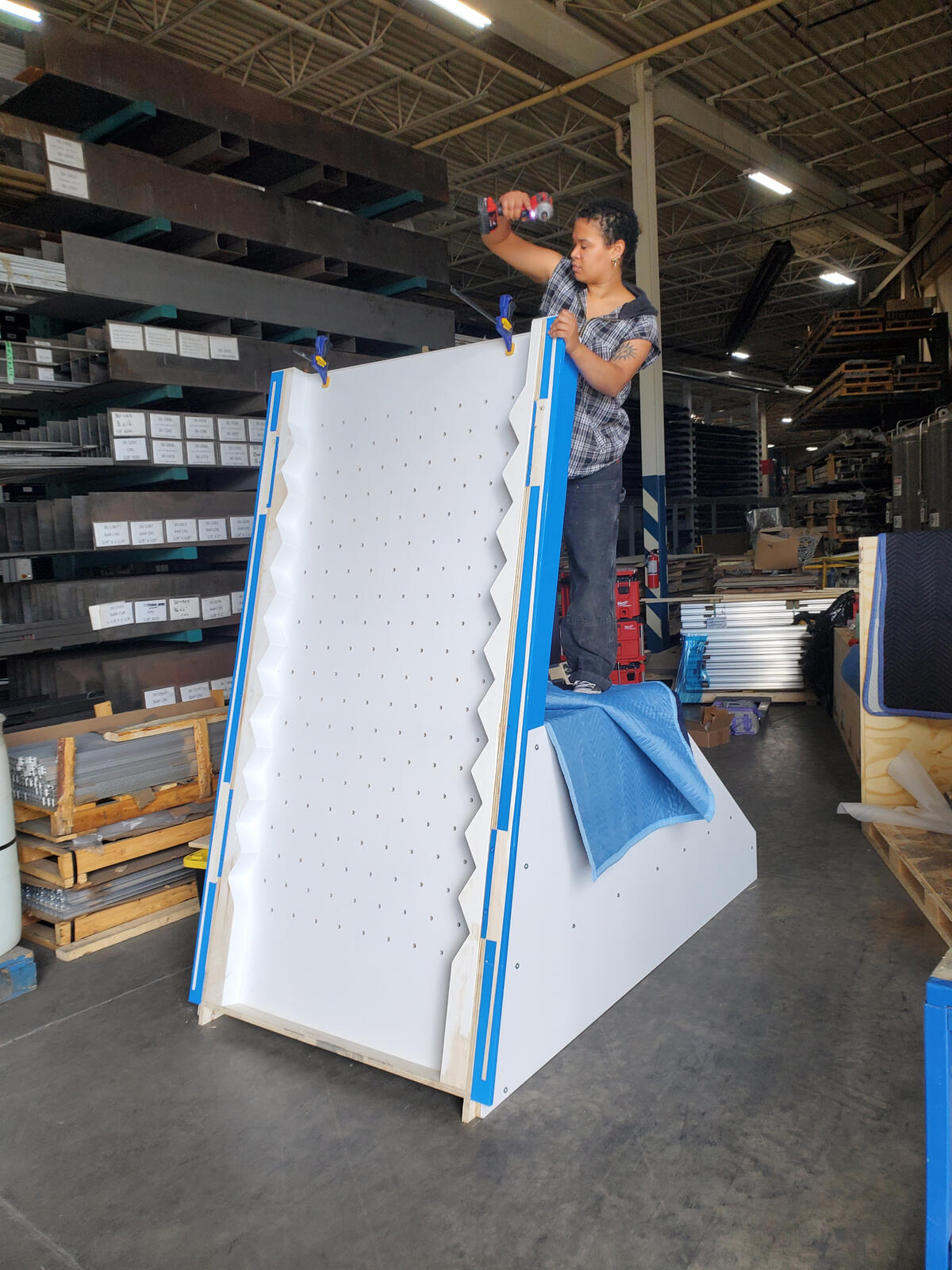
Designed by Jano Badovinac // Fugitive Glue
TITLE - Industrial Designer
ROLES - Design Engineer, Design Fabricator, Install Lead
TIMELINE - May 2023 to September 2023
LOCATION - Adidas ORIGINALS Vancouver & The Well Toronto
CLIENT - Adidas
STAKEHOLDERS - Adidas ORIGINALS Vancouver, The Well Toronto, TENK
BUILD PARTNERS - Visual Elements, UB Signs, Fugitive Glue


SKILL DEVELOPMENT
SOFTWARE - Rhino, Illustrator, Excel, Photoshop
HARD SKILLS - Carpentry, CNC design, production drawings, materials sourcing, budgeting, site analysis, cross country shipping
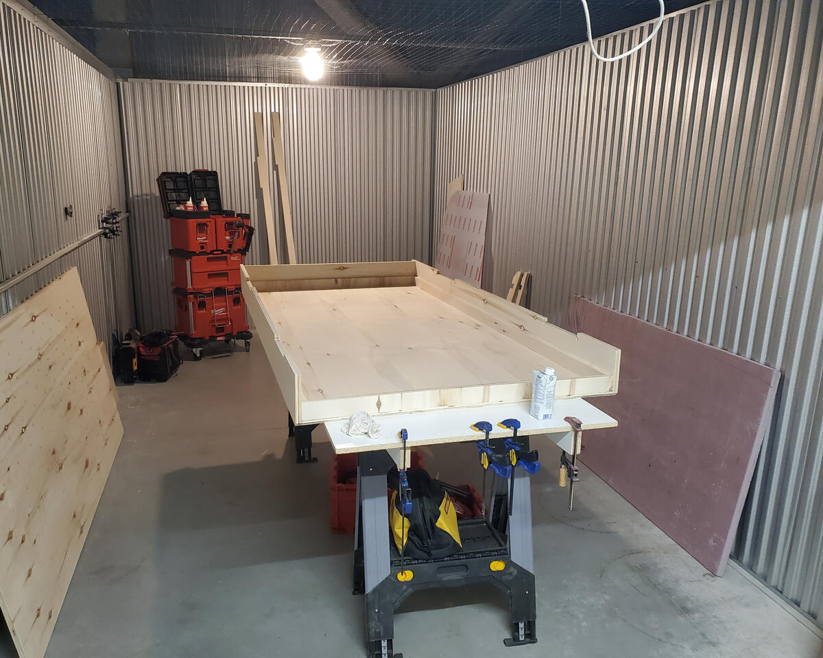
RIPPLE | CRYPTIC KIOSKS
Atmospheric cryptogram reveal for RIPPLE's talent search challenge for their first Toronto office.
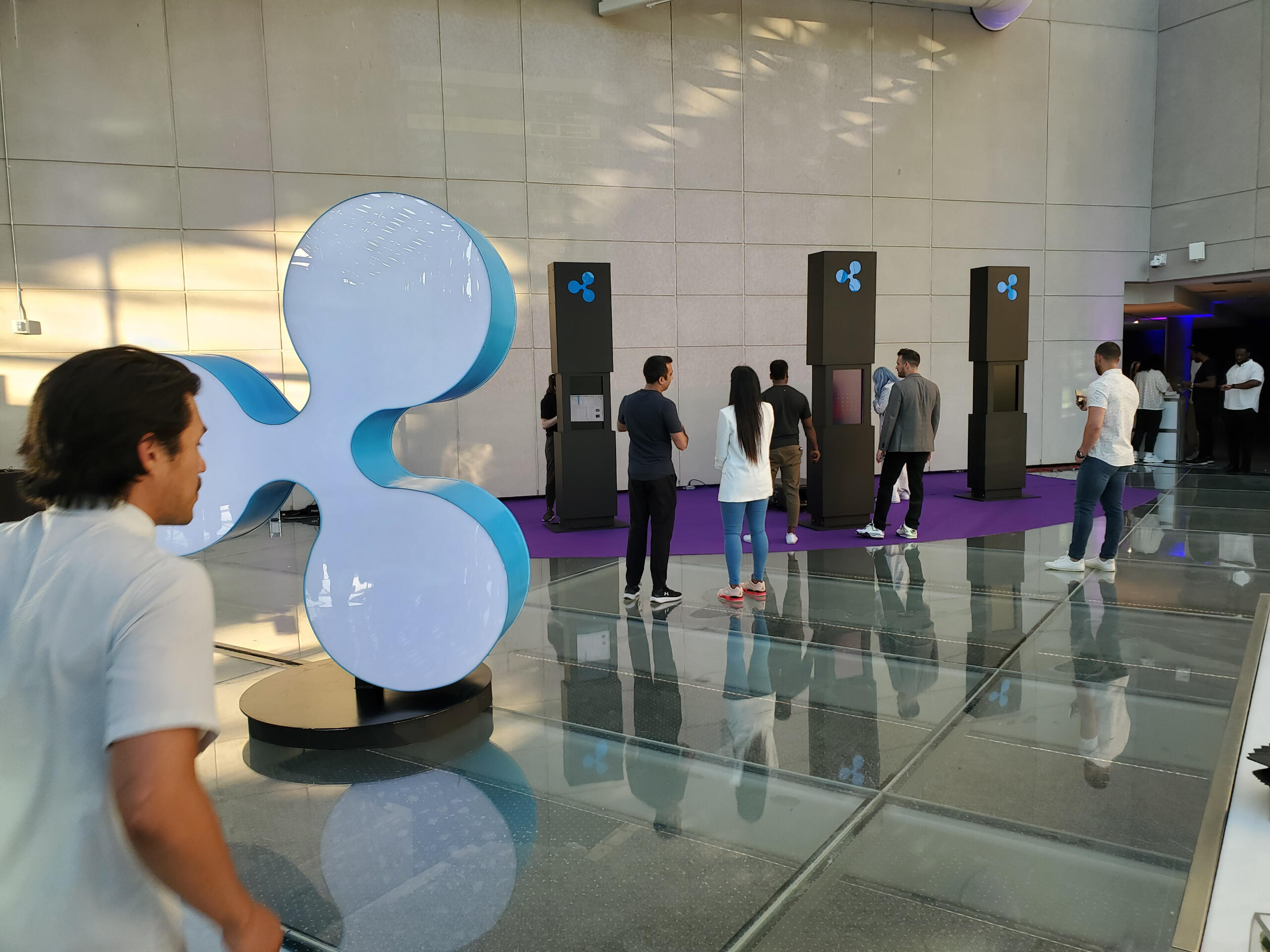


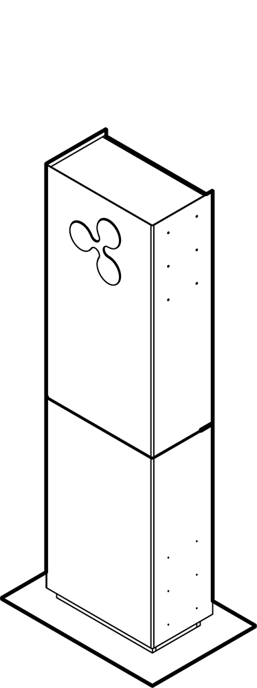


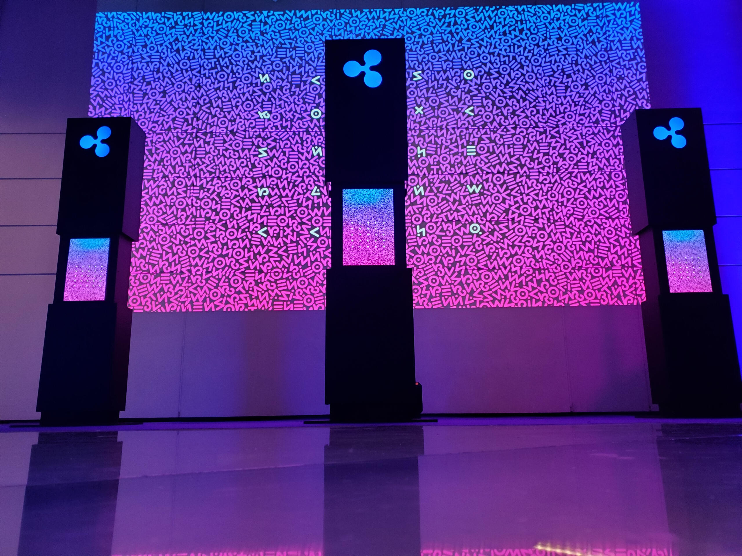


Designed by Jano Badovinac // Fugitive Glue
TITLE - Junior Designer
ROLES - Design Engineer, Design Fabricator, Electrical Designer
TIMELINE - May to June 2022
LOCATION - Hotel X
CLIENT - Ripple
STAKEHOLDERS - TENK, BlueIvey
BUILD PARTNERS - Fugitive Glue
Production journey
Video for IG Reels
SKILL DEVELOPMENT
SOFTWARE - Rhino, Illustrator, Photoshop
HARD SKILLS - Design for CNC, Electrical Wiring, Hacking, Event setup / teardown
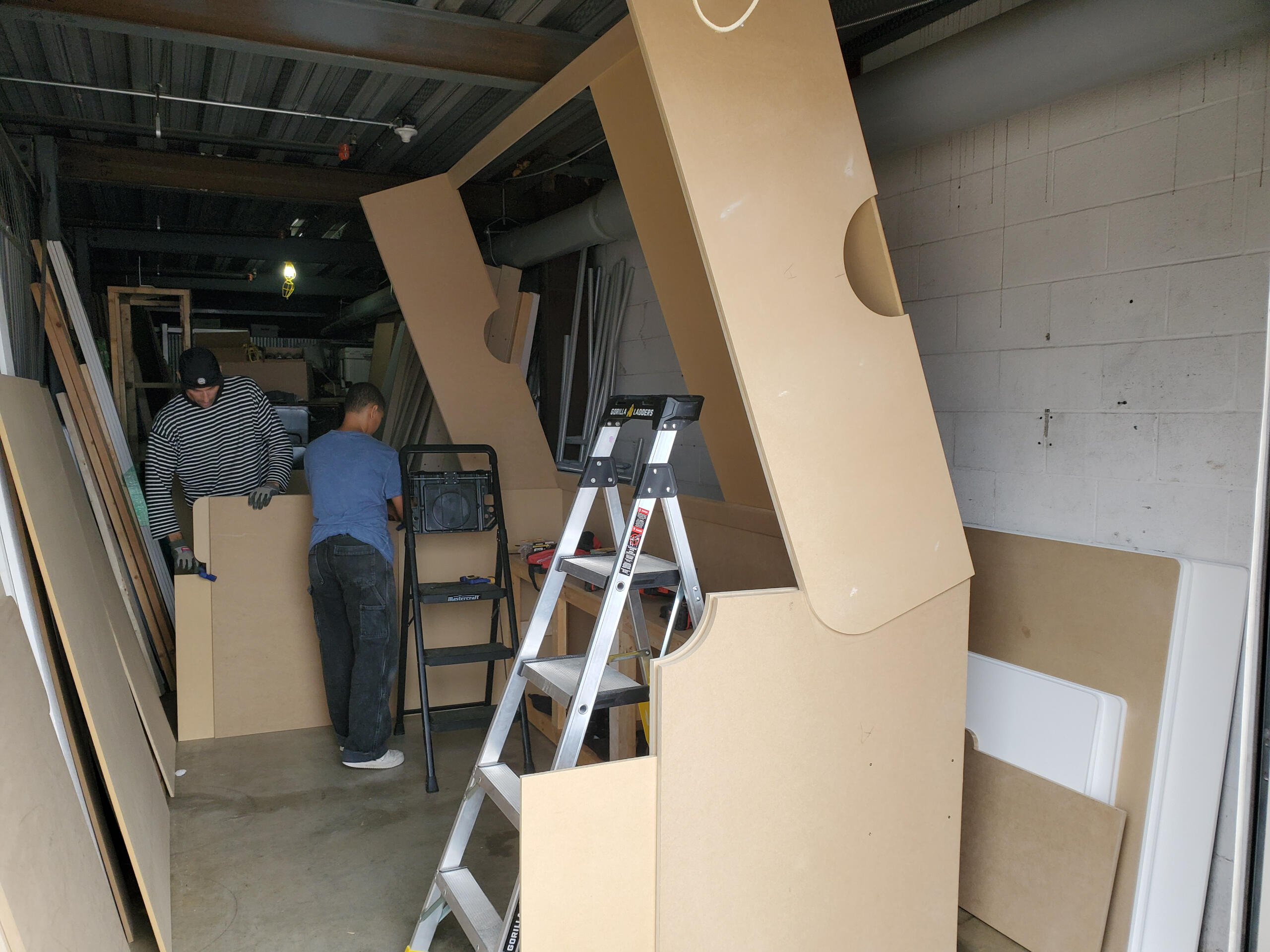
FOOTLOCKER | DJ SHOE BOX
Playful DJ booth designed to look like a 10ft scale shoebox for Foot Locker's 50th anniversary exclusives celebration.
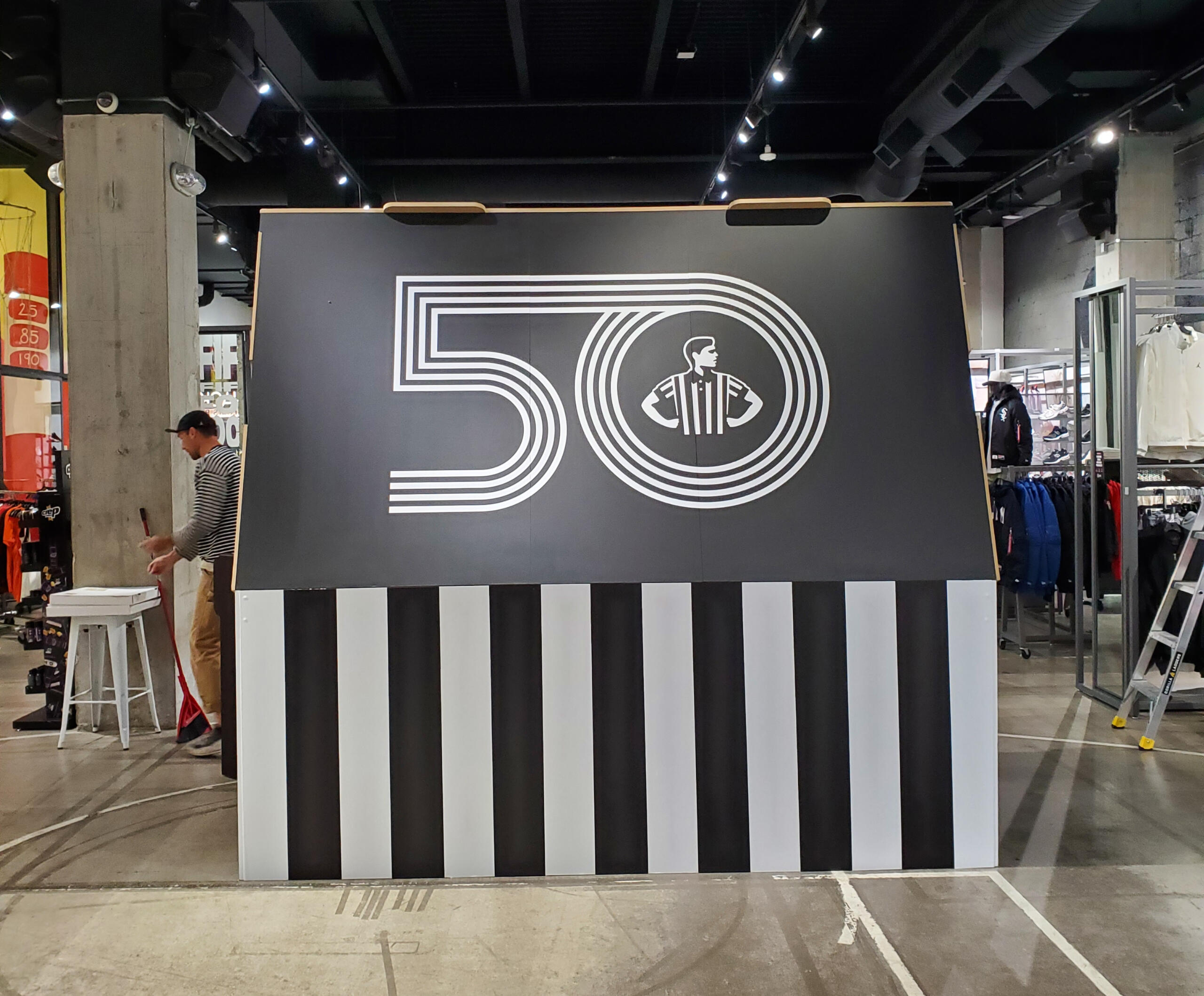


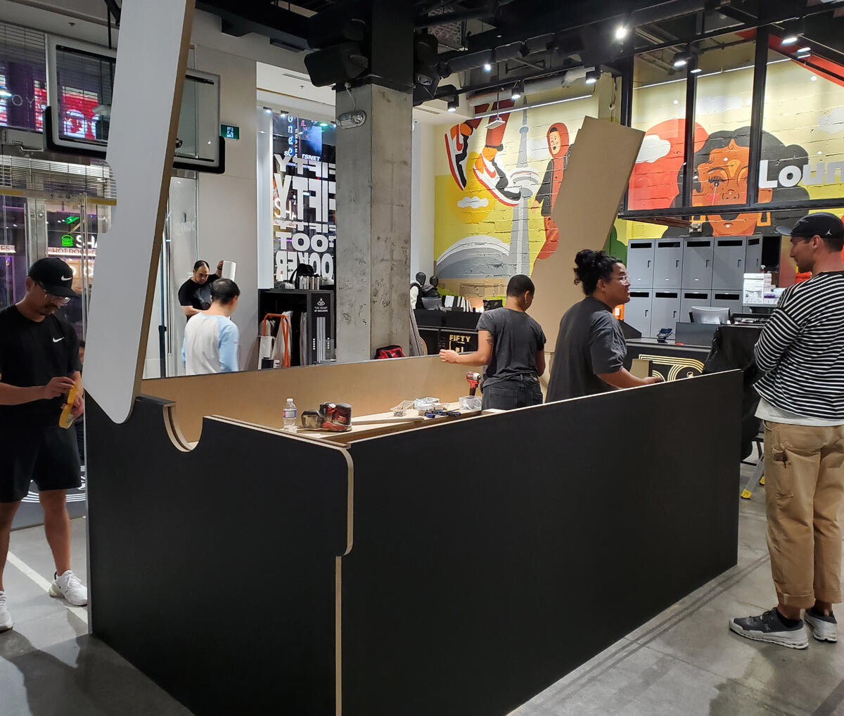
Designed by Jano Badovinac // Fugitive Glue
TITLE - Industrial Designer
ROLES - Design Engineer, Design Fabricator, Install Lead
TIMELINE - September 2024
LOCATION - Foot Locker, 304 Yonge St. Toronto
CLIENT - Foot Locker
STAKEHOLDERS - TENK
BUILD PARTNERS - Shinzo Media


SKILL DEVELOPMENT
SOFTWARE - Rhino, Illustrator, OBS
HARD SKILLS - Carpentry, 3D Modeling, CNC Design, fabrication, lighting & tech setup
SOFT SKILLS - Leadership, experiential design, on-site adaptability
INTEGRATED | Performance Stage
Design for performance stage emerging from the earth within the Kerr Hall Quad.


STINGRACK | multi-modal rack
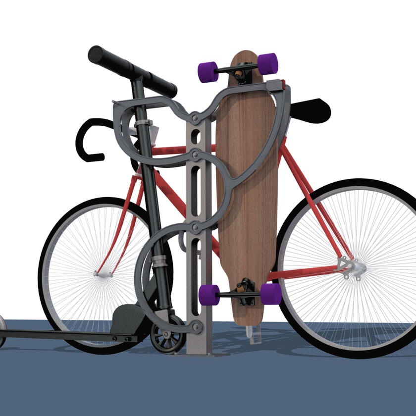
Competition winning multi-modal rack that accommodates bikes, boards and scooters in Toronto.
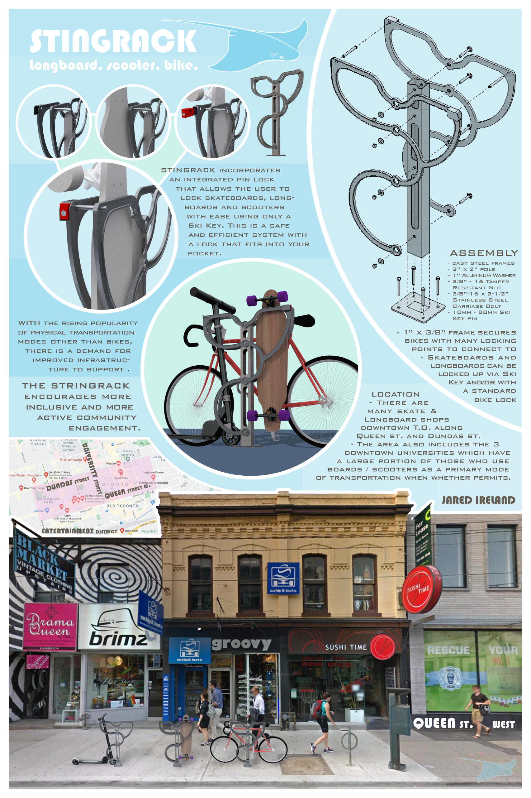


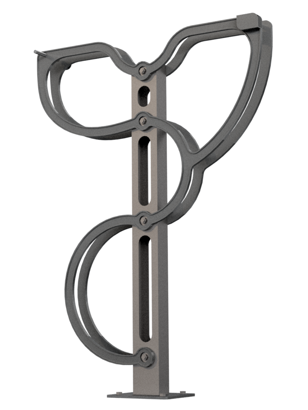
Tech Drawings


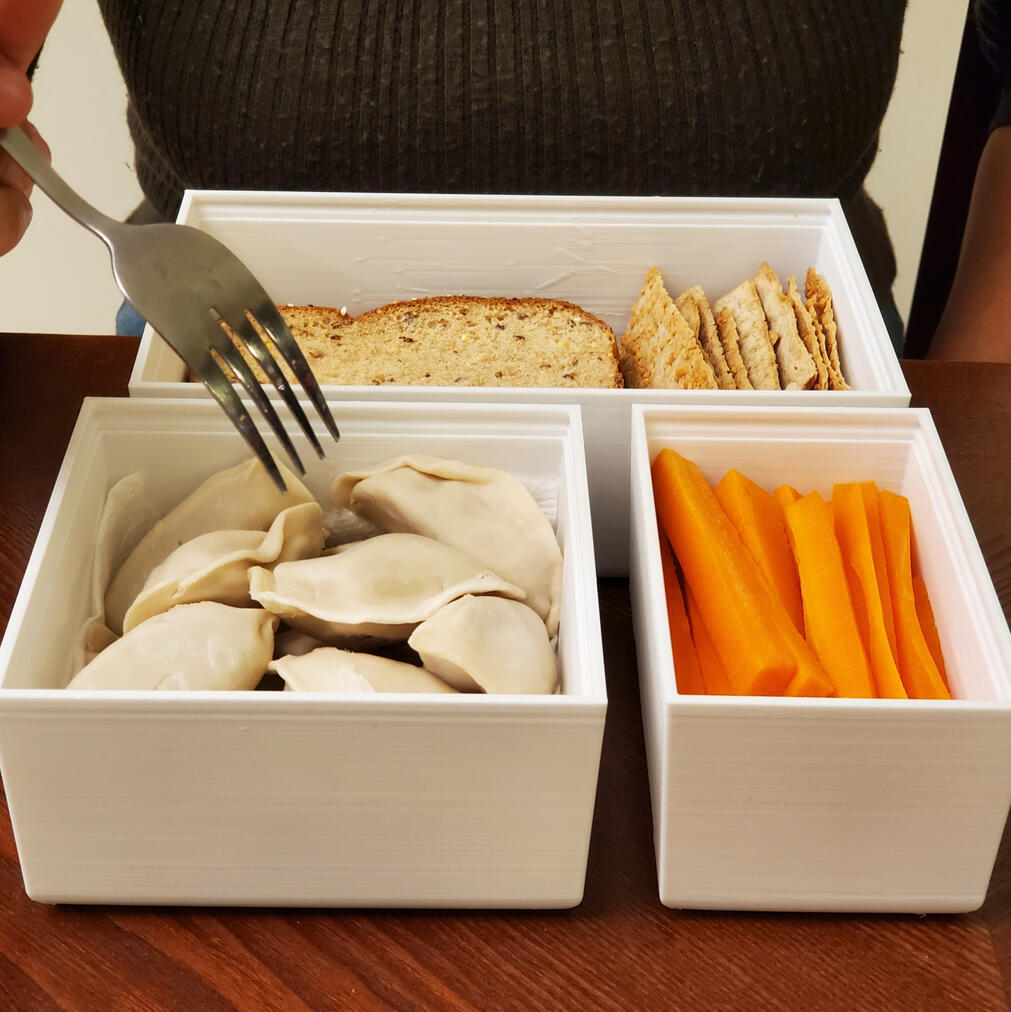
Stackt | Container
Muji inspired, three-piece ceramic lunchbox, featuring an easy-snap wooden handle for meals on the go.
Design Problem
Propose a new Muji product that fits within their brand style. The product would be intended to be used and sold in Muji hotels.I was inspired by their kitchenware, and specifically the container collections. I sought to explore their simplistic approach to design non-frivolous products that focus on ease of manufacturing and distribution.
Design Exploration
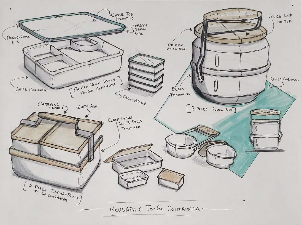


We don't stop packing lunch for the day when we grow up, so why doesn't our lunchbox grow up with us? My goal was to create a simple, yet stylish, reusable meal container that would reflect the Muji branding.
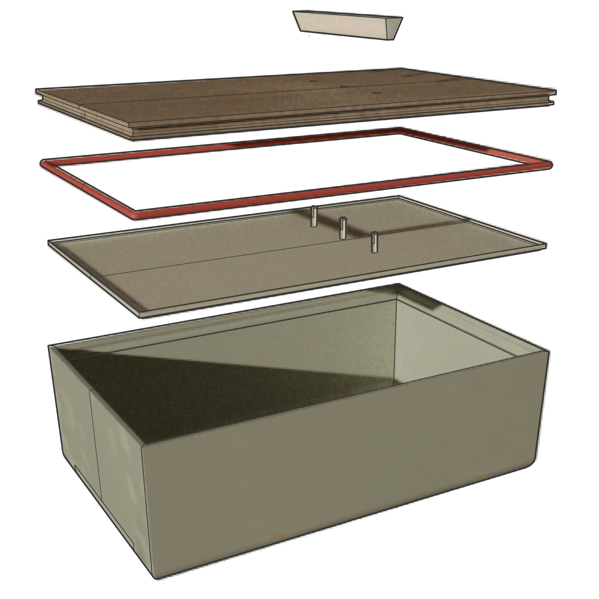
Design Features
This set of to-go containers is designed to keep your meals fresh while you’re on the go. The porcelain dish is dishwasher safe and the take apart lid is easy to wash.The lid is sealed with a gasket and lined with BPA-free polypropylene to keep it food safe and long lasting.
Product Poster


Prototype
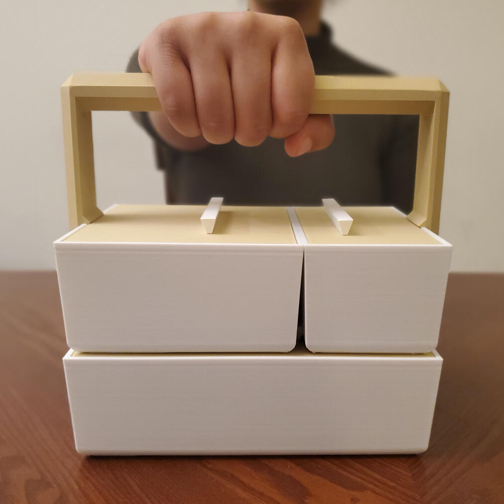
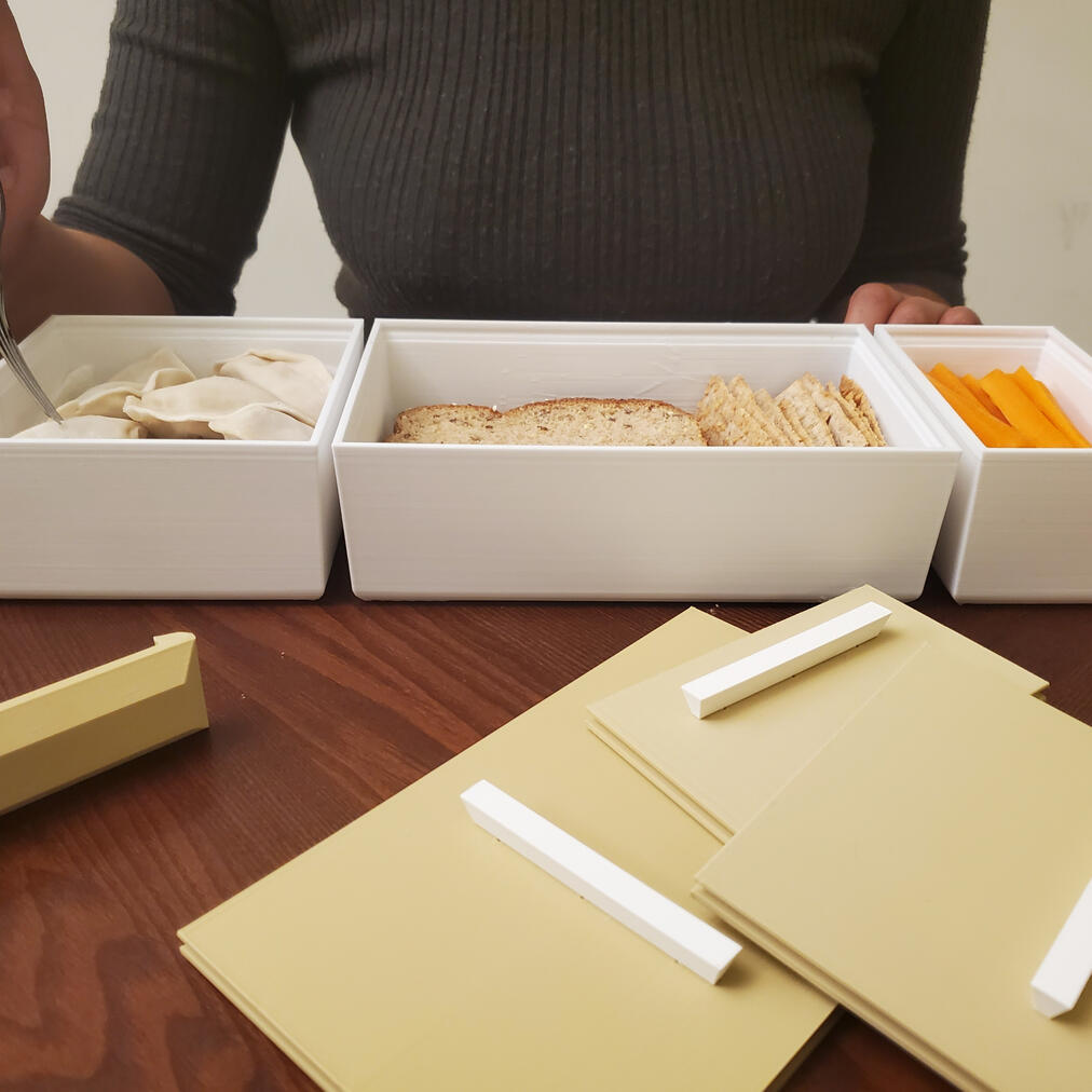
Prototype was 3D printed on an Ender 3v2. White PLA+ to mimic ceramic dish and beige PLA+ to mimic the wood lids & handle
Stackt Containers
Each container conveniently nests into each other to make for easy storage. Mix and match containers of different sizes and even colour schemes to fit whatever you're taking on the go.
Renderings


Designed and modelled in Rhino 3D and rendered using VRay for Rhino.
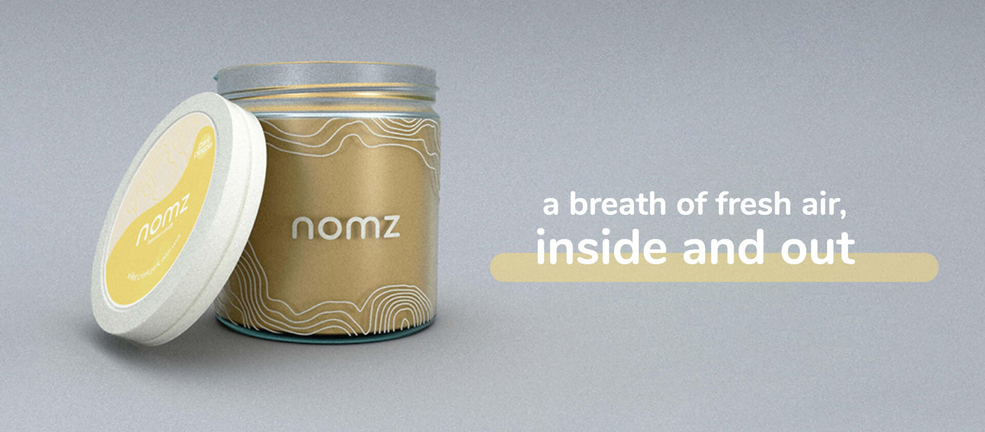
nomz | Beeswax Candle
Designed in collaboration with Michelle Wong;
Marketing and Retail Strategy by Michael Milliere.
Winning design of the Ted Rogers Retail Conference case competition, OMNI 2021.


Background
OMNI 2021 is the annual Ted Rogers Retail Conference hosted by the Retail Student Association at Toronto Metropolitan University (Ryerson). The conference focused on the omnichannel retail industry and featured guest speakers, workshops and a case competition adjudicated by the founder of nomz, Jana Zaibak. The competition happened over a 2 week period where our team of 3 students (with Michelle Wong and Michael Milliere) created a full label design series and retail strategy proposal for nomz's beeswax candle.Case Objective: nomz is seeking for a package design (name, tagline, label, design etc) to decorate the jar of their new candle. Understanding the target market for this new product, the candle should be created in partnership with a social cause that focuses on Equity, Diversity and Inclusion (EDI). nomz would like a promotional campaign, within the budget of $2000, that provides the background story of the product and the partnering organization.
Design Context
We decided to explore environmental initiatives that were local to Toronto and came across Park People. As their name suggests, they strive to improve the quality of life in cities across Canada, but their Into the Ravines initiative specifically sparked our interest as it was a local project.
Retail Strategy Pitch Deck
The pitch deck outlined our design approach and retail strategy for the product line. The candle seeks to bring attention to the land we have settled on and spark a conversation about how important it is to preserve and respect our natural ecology.
Presentation slides designed by Michelle Wong.


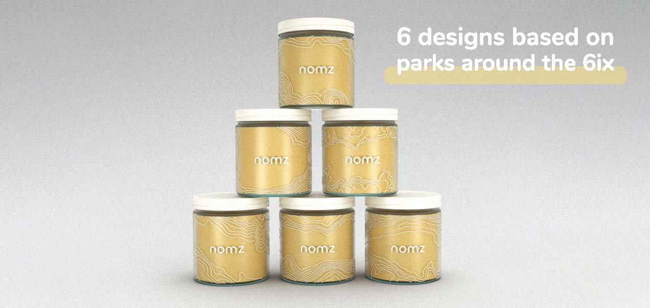
Final Design Series
The final design series features topography from 6 different parks, representing the 6 areas of Toronto. The designs would be screen printed in white directly onto the glass candle jars. Each of the parks are a part of Toronto's beautiful ravine network.

Beaumont Park
Betty Sutherland Park

Cedarvale Park
Chapman Valley
Morningside Park
Wilket Creek


Competition Results
After pitching our series of ravine designs, our team was awarded a contract with nomz to produce a series of designs that would be used for their new line of beeswax candles. Below, you can see the final designs created by Michelle Wong and I in the summer following the case competition.
We worked together to conceptualize and curate the series, but we split the designs up so each of us was in charge of designing 5 of the 10 graphics. The design series was in partnership with Ecotrust Canada, with a portion of the sales going to their programs that support the national parks around the country.

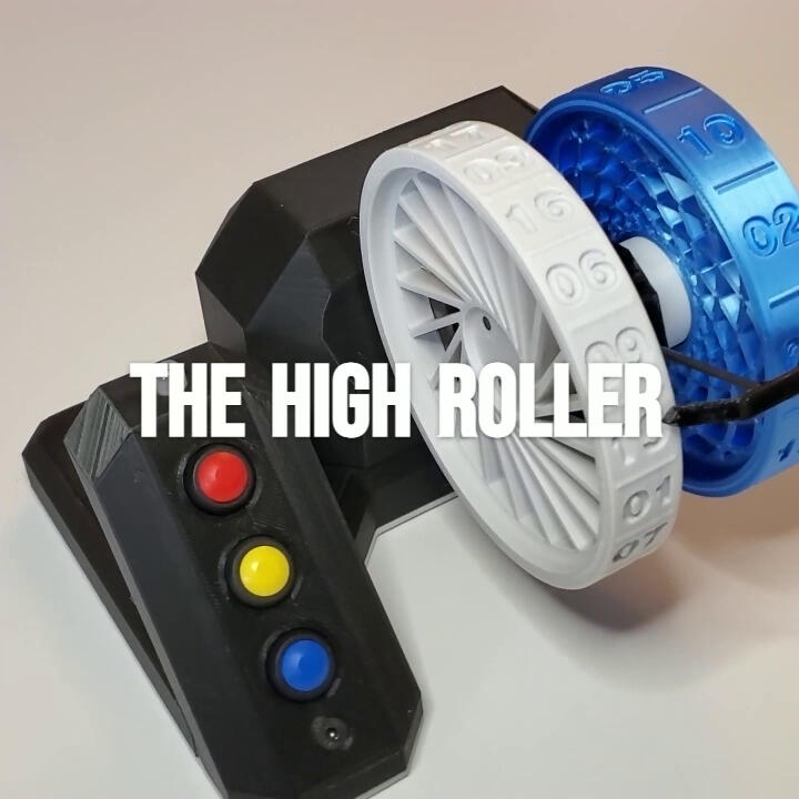
HIGH ROLLER | Electronic dice
An over-designed, modular disk-dice roller.

Project description
Introducing the High Roller - an automatic dice roller. Designed to generate a random number, truly randomly, every time, without being limited to 4, 6, 8, 12 or 20 sides.The High Roller has 2 independent motors inside that transfer their rotation to a bearing via a belt with a 2:1 gear ratio, allowing the discs to spin up to 166rps. The device has 3 buttons that will spin the discs in 3 different ways: The red button will spin it until you let go, the yellow button spins it back and forth randomly, for a random duration, at a random speed a random number of times (yes, that is a lot of random), and the blue button will spin it for 1-5 seconds at a random speed. When a button is pressed it immediately activates the motors and the RGB LED which glows the colour of the button to visually indicate which spin profile has been chosen.The dice-discs have been designed to magnetically couple to the bearing cap in order to be easily removed and replaced with an unlimited variety of other discs. The two dice-discs I printed for this project have 20 sides and 12 sides respectively to demonstrate how standard dice may be replicated as discs – down to the way the numbers are distributed around the ring (numbers on opposite sides add up to 1+maximum number) – but I plan on printing a full set of standard dice, as well as specialty discs that could never be represented on a regular polyhedron; such as a set of discs with the English alphabet as a means to generate random initials. The possibilities are truly endless.
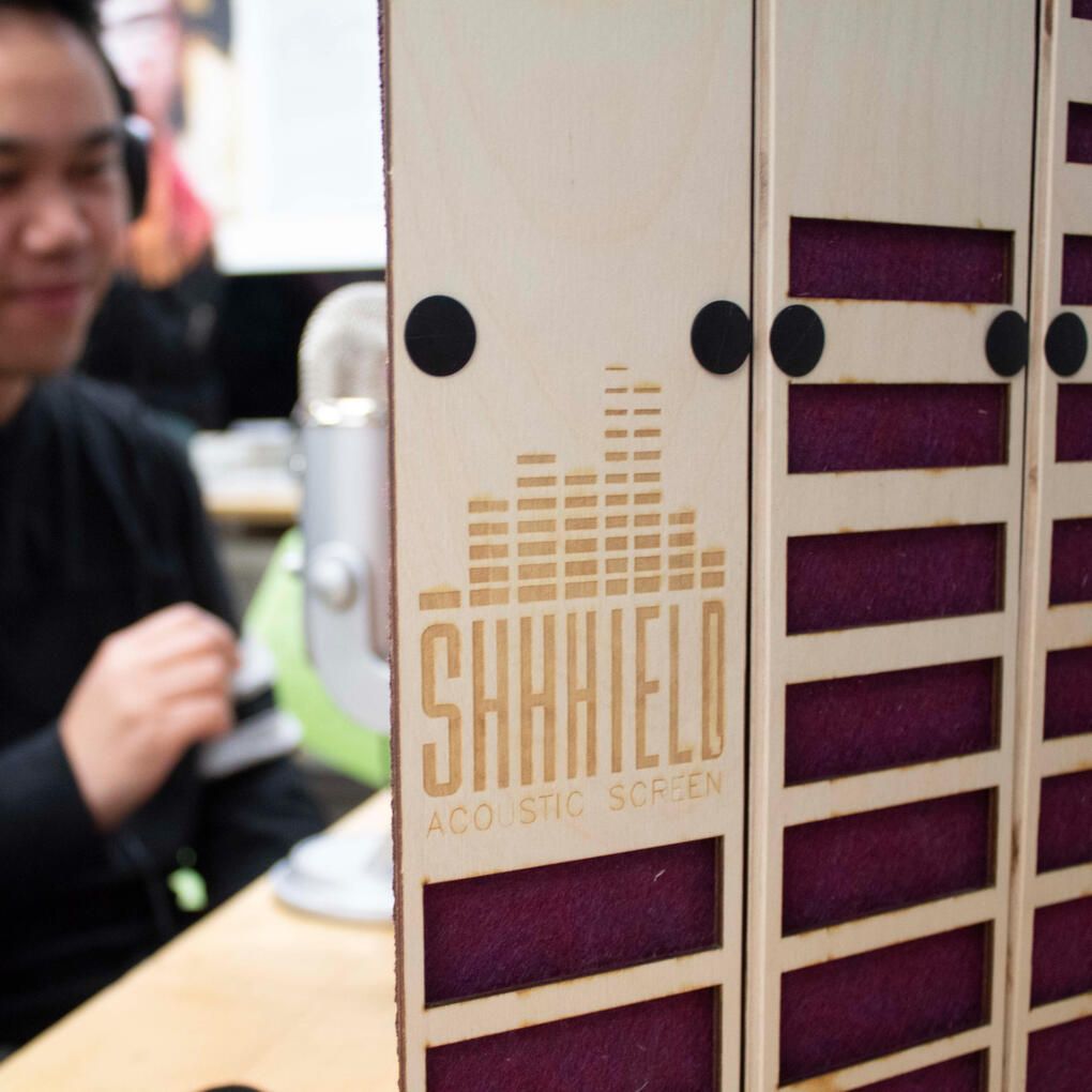
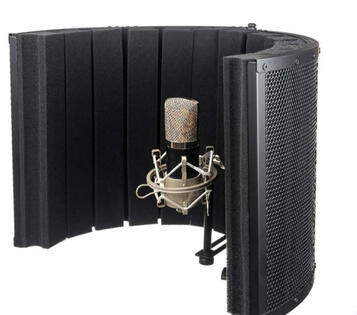
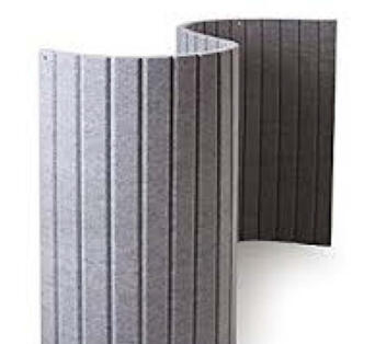
SHHHIELD | Acoustic Screen
Designed in collaboration with Michelle Wong
Portable acoustic barrier for those who record audio outside of a dedicated studio environment.


Project Overview
This was a first year design project where we were challenged to create a product for a *digital nomad that could be flat-packed, using laser cutting as the primary manufacturing method.
Michelle and I decided to focus our user group on professionals who record audio on the go. Since studio-grade audio equipment can be prohibitively expensive for those who are trying to break into the industry, or simply freelance, we wanted to design a product that would help improve the audio quality of their recordings.
*digital nomad: noun | A person who earns a living working online in various locations of their choosing (rather than a fixed business location).
Inspiration
Untitled
Untitled
Untitled
Untitled

Untitled
Untitled
Untitled
Untitled
Untitled


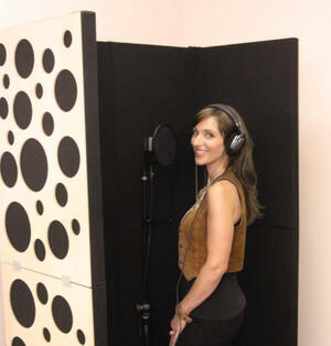
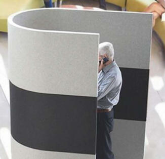
There are a plethora of portable sound barriers/booths to pull inspiration from. The products we researched used a variety of materials and methods to dampen sound, but very few of them are portable for 1 person.
Intention
Many freelancers in the audio and film industry face hurdles when recording audio outside a professional recording studio. While privacy and quiet can can sometimes be found in public settings, various environmental factors interfere with audio quality.
Design Prompt
Create a portable sound dampening system for those recording on the go.
| MUST | SHOULD | COULD |
|---|---|---|
| Dampen sound | Collapsible | Modular |
| Portable for 1 person | Can accommodate external audio equipment | Water + dirt resistant |
| Self-stabilized | Easy to set up + pack away | Sustainable materials |
Material Exploration
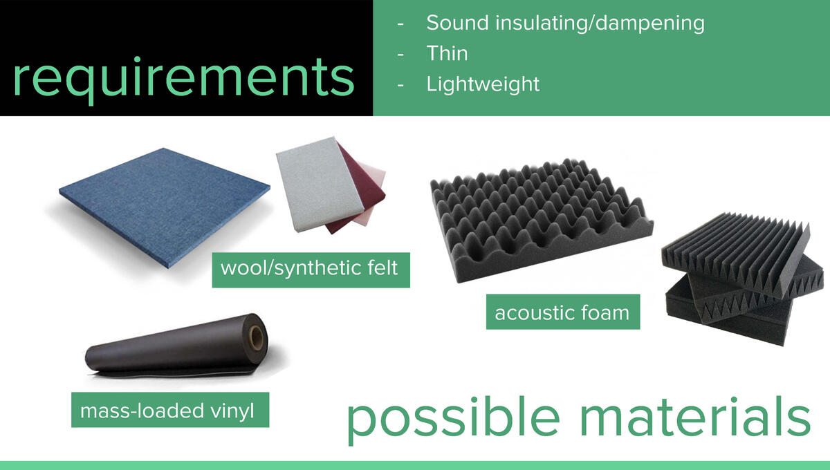
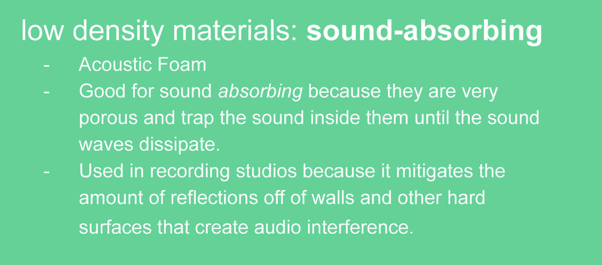
We explored the different materials that have sound dampening properties and considered whether we should use high-density or low-density materials. Many acoustic screens and baffles utilize materials like wool, felt, MLV and acoustic foam.
We discovered that low-density materials create the environment we are aiming for, since we don't need to reduce the amount of sound transmitted through the material. Lower density materials are better for reducing sound reflected back at the mic which will create a better sound profile when recording by reducing the perceived room size.
Design Exploration
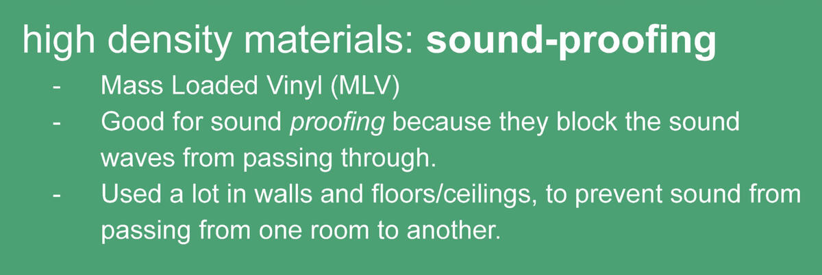
We explored possible shapes and designs for the acoustic screen that were based around the idea of using a 2-layer panel system with a hard outer shell and a soft, low-density inner wall.
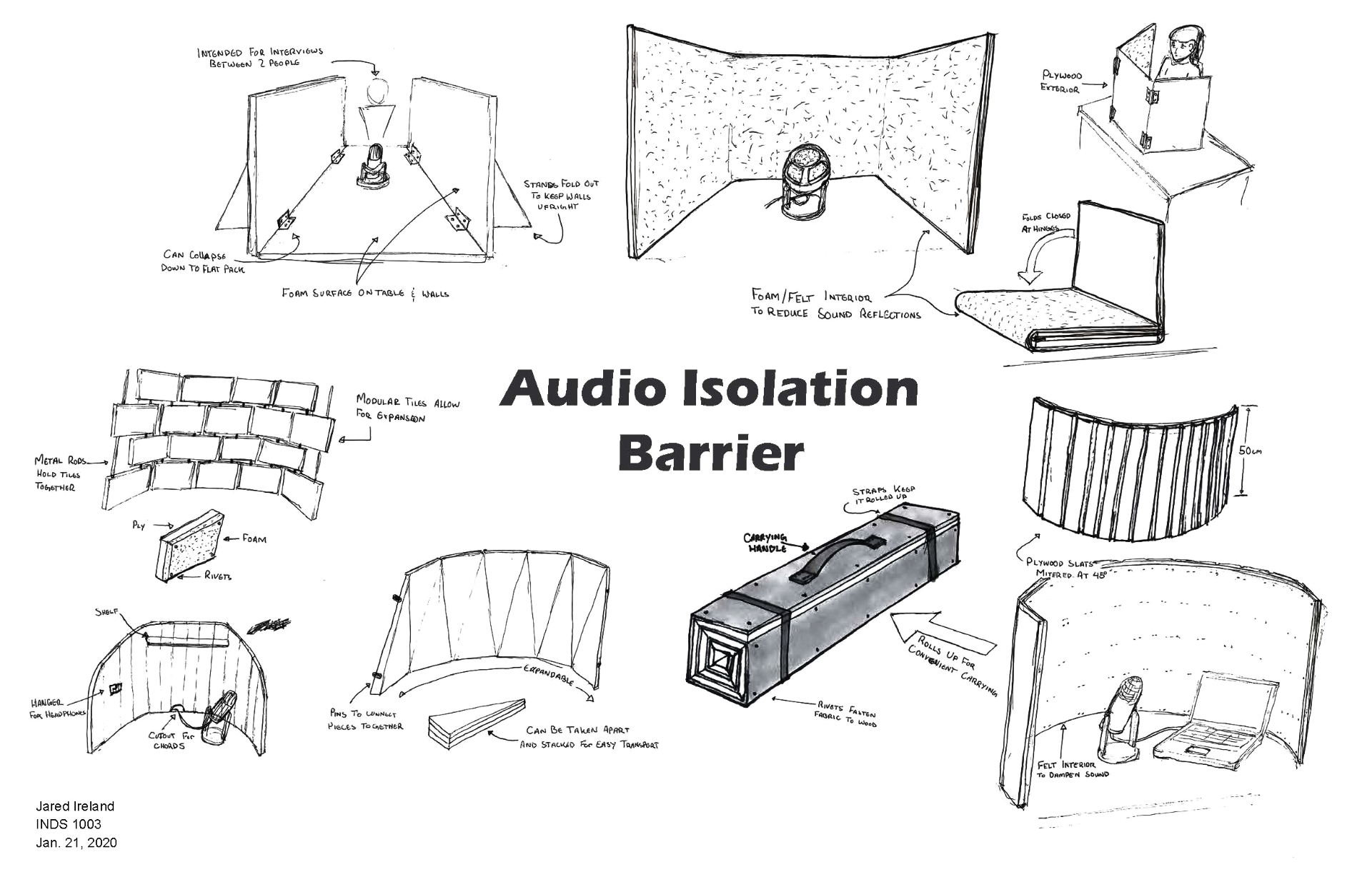
Some designs used large, folding panels and some were comprised of a series of tiles. The panel designs were appealing because they would require fewer components, but they lacked the flexibility of the tile designs.
Study Models
We built a few rough study models to get a sense of scale and proportion, as well as materiality. The cardboard sketch model was useful for testing the rolling mechanism and testing if the size is appropriate for use as well as portability.


We also experimented with a few cut patterns for the panels. The horizontal cut lines were definitely more effective than the vertical cut lines as the panels needed more rigidity in the x axis as well as looking better aesthetically because it contrasted the verticality of the panels.
Final Prototype
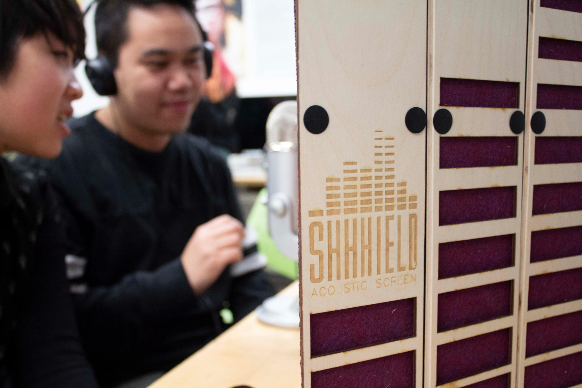
Our final prototype was created out of laser cut plywood, 3mm felt, 1/4" plastic rivets, and a Velcro + nylon strap for carrying. We also laser etched the logo into both the front panel and the felt so that it would be visible while open or rolled up.
The wave pattern cut into the front is an audio wave from a recording we took in the shop. It provides a unique aesthetic to the front as well as reducing the overall weight of the screen.


Manufacturing
Below are the design drawings from the general assembly that outline the dimensions of each part.
We intended to use Chicago screws instead of rivets, but they were difficult to procure so we had to settle. This resulted in the prototype looking less clean but it still got the job done and it was more cost effective.


General assembly drawings from a 3D model created in Rhino. The drawings were exported and post-processed in Adobe Illustrator and Photoshop.
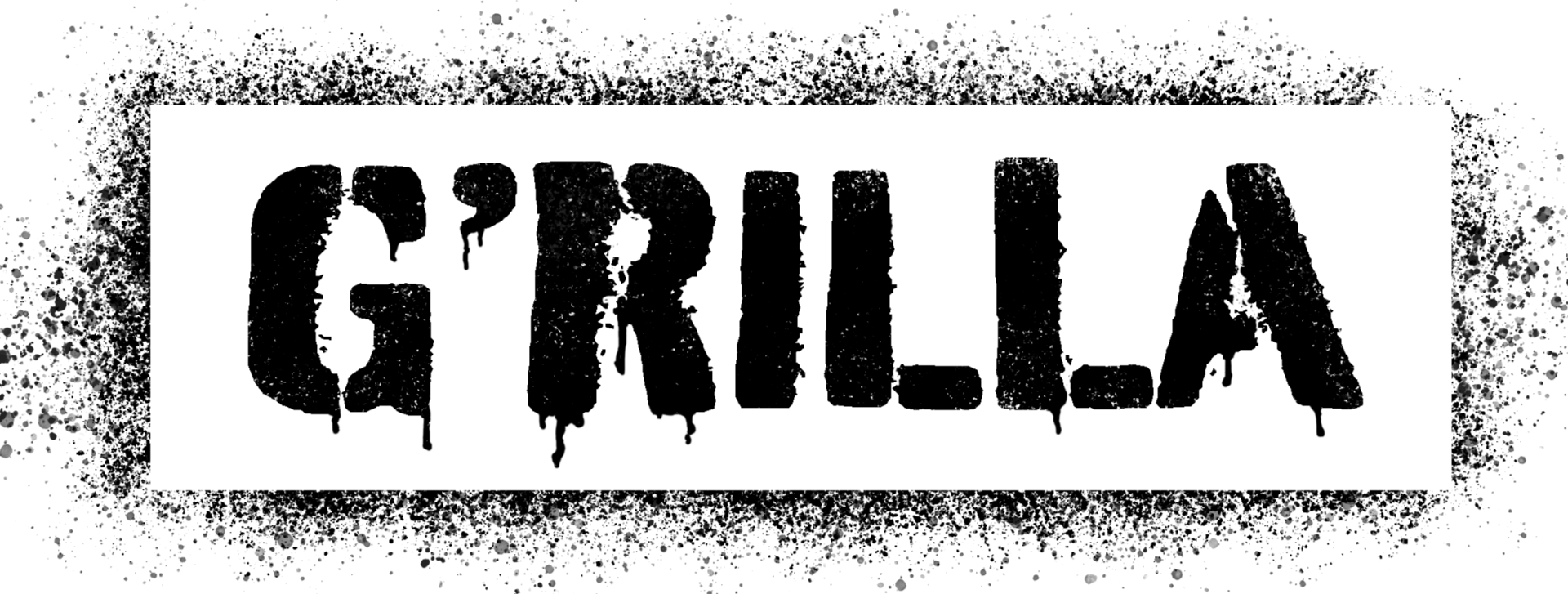
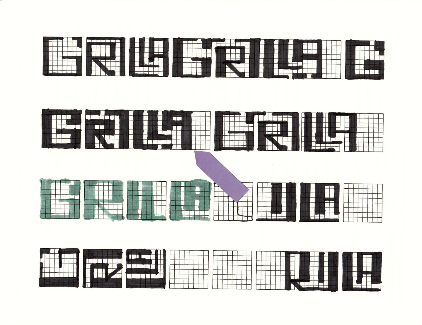
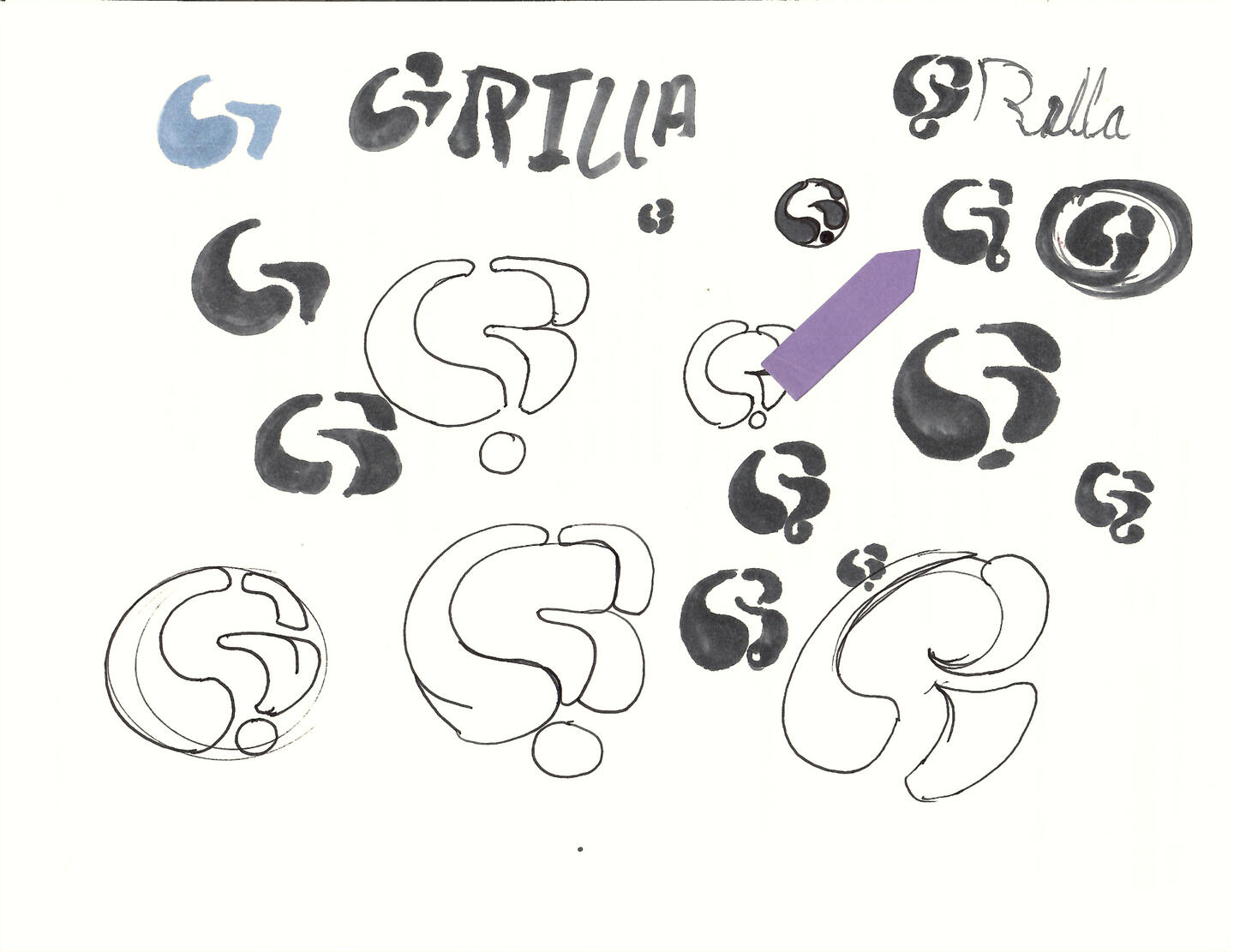
G'RILLA | Logo Design
Four-logo brand package commissioned by a local indie theatre & production company called G'RILLA.

G'RILLA Production Company
G'RILLA is a local theatre + production company founded in 2018 under the name NTC (Notorious Theatre Company).
In 2021, Co-artistic directors, Nicci Pryce (top) and Kareem Vaude (bottom), sought to redefine the company with a new name and branding that more closely resembled their ideals as queer/BIPOC artists and producers. Under G'RILLA, Nicci and Kareem want to be the face of positive change in the industry by promoting diversity in storytelling through race, gender, sexuality, and body.
Inspiration
Untitled
Untitled
Untitled
Untitled
Untitled
Untitled
Untitled
Untitled
Untitled
Untitled
Untitled
Untitled


Intention
The team was looking for a design style that would be indicative of their ideals and brand personality. After some discussion, we narrowed down their desired characteristics to three main design styles / trends: Graffiti, Pop Art & Comic.
| Graffiti | Pop Art! | Comic |
|---|---|---|
| Spray Painted | Recognizable Imagery | Stippling |
| Stylized + Punchy | Bright Colours | Emphasis |
| Tag/Stencil | Mixed Media | Hard Outlines |
| Bubble/Block Text | Irony/Satire | Screen Print |
Initial Concept
The first concept that we explored was inspired by graffiti stencils. They really liked the handmade aesthetic of the dripping paint and the overspray. They also liked having a letter mark for profile pictures as well as a full word mark.
I planned to expand on this by creating brand iconography that continued with the spray paint stencil theme. We all agreed this design required a lot of refinement, though.
Exploration
I began ideating on the design by sketching out some rough logos on a grid because I knew I wanted to use a custom font that feels rectilinear and balanced. The grid allowed me to play with proportions and weight while being able to balance the positive and negative space. The team liked the bold lettering and stencil-like appearance because it was very divergent from the original logo design.


Other Concepts
I explored some other concepts based around the idea of a backwards question mark hidden in the negative space of the G. The style was inspired by graffiti and is meant to feel bubbly and playful. In some of the ideation I was playing with the idea of composing the G of shapes that were indicative of an apostrophe or an arrow to capture some movement in the logo.


Brand Colour Palette

Unpeeled White

Red Gorilla

Go Bananas Yellow

Seeing Purple
The team is looking for a PUNCHY, high-contrast colour palette. Their previous logo was a gold and black design which was difficult to use in a lot of contexts. By creating a colour palette with 2 secondary colours allowed for multiple colour ways that could be utilized on a variety of backgrounds.
I settled on an off-white primary, a bold red and purple for the secondary colour, and a nice yellow for an accent. These colours illicit energy and excitement with a touch of creativity. The deep purple also alludes to their old branding under NTC, as their logo was a crown and purple gives a sense of royalty.


Letter Mark Logo


It was important for them to have a standalone letter mark to be used as an icon, so I designed the G' to work with the vertical logo as well as on it's own. The apostraphy helps the form stand out more as a "G" and be indicative of the full name G'RILLA.
Word Mark Logo
This is the main logo design in the series. It features the full G'RILLA name in the signature high-impact font. The intention was to create something that is fully legible while still referencing the urban, graffiti style. Choosing to stack some letters allowed me to utilize more of the negative space and contract the name so that it felt more compact.The balance and linearity of the negative and positive space gives the design a maze-like feeling that causes the viewer to take in each letter form as well as get a sense of object permanence from the whole composition.


My profile | About Me
About Jared Ireland
DESIGNER // MAKER // INVENTOR
Industrial Designer with 7+ years of experience across 3D design, rapid prototyping, graphic design, design for manufacturing, creative coding, and electronics design. Skilled in translating concepts into functional, human-centered solutions, with a Bachelor of Design and a Wearable Technology minor from OCAD University. Founded and led the Industrial Design Student Association, launching a mentorship program that supported first and second year students.
Award-winning designer with competition wins including the 2021 Ted Rogers Retail Conference Case Competition and Finalist in the PAVE 2020 Student Design Competition with Michael Kors.
Currently an Industrial Designer at Fugitive Glue, contributing to immersive brand experiences and installations for clients like Adidas. Experienced across the entire design lifecycle — from concept development and 3D engineering to material research, budget creation, and on-site installation and problem solving — while managing stakeholders, multidisciplinary teams, navigating evolving project landscapes to deliver high-impact results.
Contact | Get in touch
CONTACT
If you need to reach me for any reason you can get in touch by filling out your message and info in the form below.I am open to job offers and freelance work, schedule permitting.
Thank you
Thanks for reaching out, I will get back to you as soon as possible.In the mean time, feel free to explore my collection of featured work, or check out my socials through the links below.